26 Apr 2020
(throughout this post, I refer to Brasil with “s”. This is one of my
political quirks. I do know most people do not prefer this orthography)
It is time of Coronavirus. The world has been put to a halt because of an
invisible enemy. The world as we know it has changed, and will likely not
be back for a while. Countries have closed their borders, people are
confining themselves at their homes, bracing for the hard times to come.
In my self-confinement, I was struck by an observation. One that has
been more or less made by many, but not with any data to back it
up. In this blog post, I’ll try to make it more evident, using some data
I realized I had relatively easy access to.
When I started writing this blog post, the Coronavirus had just started
getting to Africa, and people had been wondering why the virus seemed to
just not have gotten there. Many have suggested that it was the warm
weather. After all, as I heard some people suggest, “in the majority of
the continent it’s still summer” (of course, this is not true: the vast
majority of Africa is in the northern hemisphere, with seasons “in sync”
with the rest of Europe, despite the obvious warmer weather). I was not
very convinced: why had it gotten already to Brasil, then, where it was
actually still wintery? Or, even better, why did it get so bad in
Ecuador, a country literally named after a line that implies it is really hot?
(By the way, as of the time of this writing, Ecuador is the
most dramatic case in South America at the moment).
One important difference between the Coronavirus and many diseases
humanity has seen before is that it likes to attack the rich first.
(Maybe not the “rich”, but at least the “better off”.)
It likes those with “the resources”, who can pay for food in nice
restaurants, and cafés, and bars, who go to the cinema, and like
their overpriced coffees or frappuccinos and what-not in their
fancy Starbucks, speaking different languages, traveling, going to
shows, sports events, music festivals.
The good side of it is: they can self-quarantine.
The bad side is: there is a whole lot of people who can’t.
So when I started writing this blog post, I had another explanation
for why the Coronavirus didn’t like to travel to Africa.
I had long been looking at the development of the virus across the
states of Brasil, and found it interesting how the virus was very
fast at arriving in São Paulo or Rio de Janeiro, but took quite
long to get to less developed states like Tocantins. I was using
this website,
made by the people in the Universidade Federal
do Rio Grande do Sul (UFRGS, my University), to track the developments
of the virus, and, since the data they use is
in a quite nice format,
I thought I could try using it to answer some of my questions.
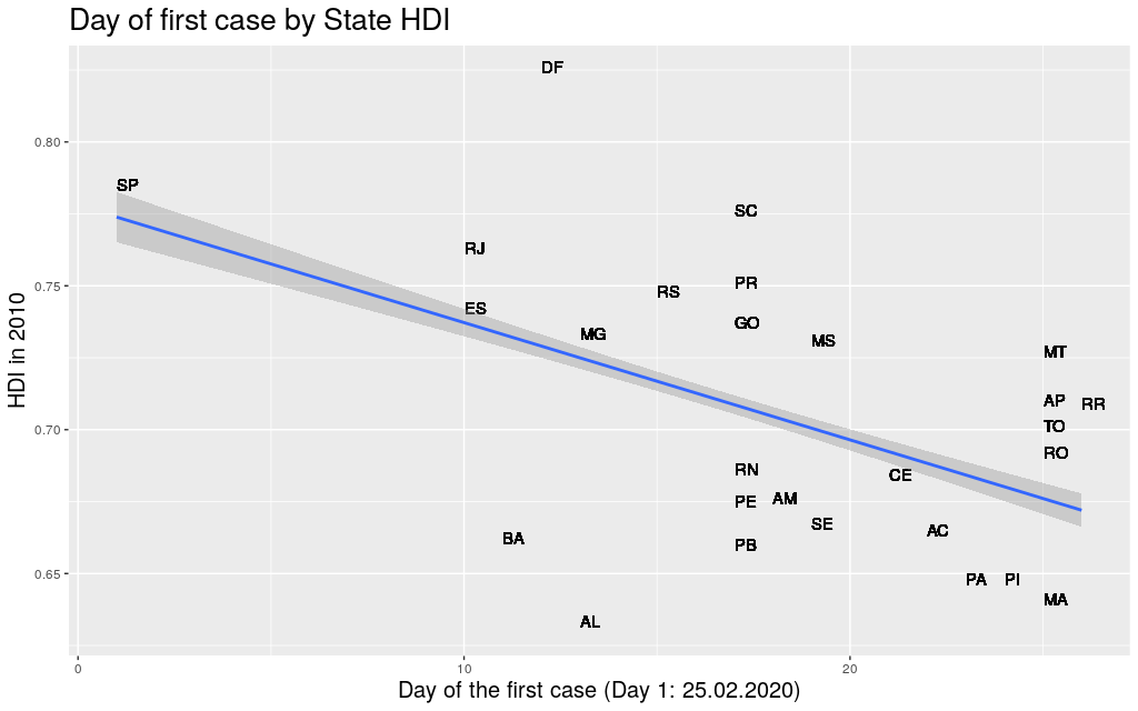
The first thing I did was to take the data for each state, get the
first day when the Coronavirus arrived at that state, and compare it
with its Human Development Index. Using Human Development Index as
a proxy for “richness”, I thought it would be nice to see if it
was really true that “development” would be somehow predictive of
the movement of the virus.
Some people have spoken about how inequality could be a problem in
the fight against the Coronavirus. People in lower financial status
have higher risk of all sorts of health conditions (heart disease,
diabetes, Alzheimer, …), and therefore
are more likely to be in risk groups.
I went to Google Scholar in search
of any academic work about the effects of inequality on the fight
against Corona, but literally only found
this
and this,
both of which are just opinion/comment papers looking at inequality
as a source of other health conditions, but not at all as a predictor
of the movement of the virus around the world.
Well… at least in Brasil, in the state level, there seems to be a
correlation between the two factors.
But both the HDI and the Coronavirus data that I was looking at had
not only information on the state level, but also on the municipality level.
Now… some disclaimers need to be done when interpreting these data.
Except for the richer states, most of the airports in Brasil are in
state capitals, so it is obvious that the metropolitan area of the
state capitals are very likely where the
Coronavirus would first appear, independent of their HDI.
Also, Brasil has not been testing a lot, for a lot of reasons that
are just too complicated to explain here (in a nutshell:
presidential incompetence, lack of money, competition for tests
against richer countries, diplomatic nuisances, fights inside the
government, …).
To make sure I didn’t get somewhat “polluted” data, these data are
from April 10th, because there were news from April 11th saying that
the government would start testing more, but only in a few states,
and I was afraid this would deform the data in unexpected ways.
(Still, since I’m only looking at the date of “arrival” of the virus
in the different places, even that wouldn’t be a problem.)
Finally, the sizes of the states and
the number of municipalities in them vary widely. For example,
take São Paulo, the most populous state. It a state that is “average”
in size, has an area of 248Mkm² (roughly the size of the UK) and has 645
municipalities. Then compare São Paulo with Amazonas, the biggest
state, with an area of
1559Mkm² (roughly the size of Mongolia). The entirety of that area
is divided in only 62 municipalities!
This means that the virus needs to travel much less to go beyond the
borders of a municipality in São Paulo than in Amazonas, and there
are way more people for the virus to infect in these smaller
municipalities in São Paulo than Amazonas. The variance is huge!
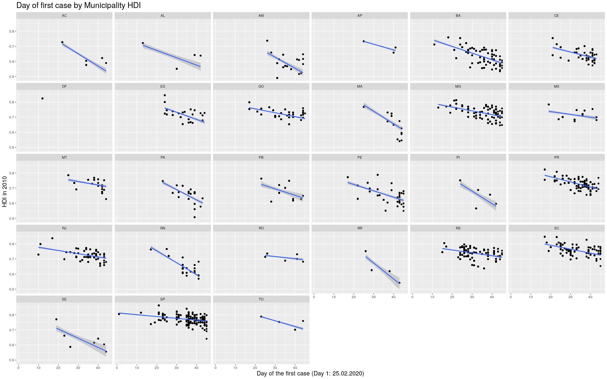
Ok. With these disclaimers in mind, let’s take a look at some of
the states. In the graphs below, each point represents a municipality.
I’m not naming them because I’m assuming most readers won’t actually
care. I am only including municipalities that had already registered
at least one case.
The following are the data in my state, Rio Grande do
Sul (shortened as RS):
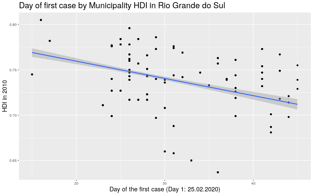
It looks like the trend is also there: the higher the HDI,
the earlier the day of arrival of the virus. So I thought I
would play
around with other states. Since I mentioned São Paulo (SP) and
Amazonas (AM), maybe it makes sense to look at them too:
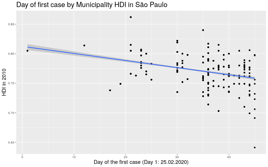
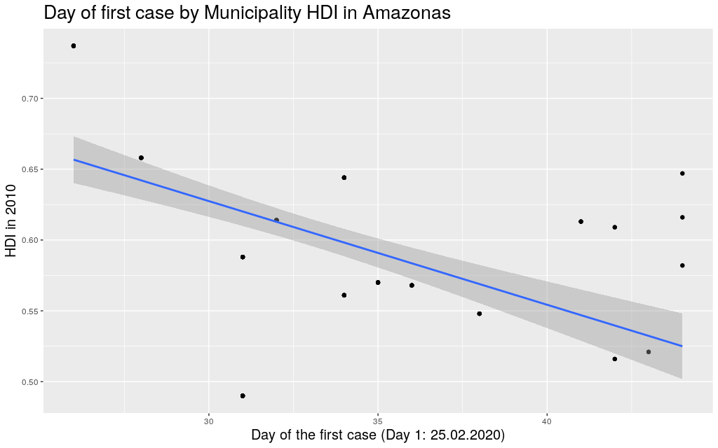
Indeed, this trend is literally in all states of the federation:
 Click here for the full image
Coming back to the question that spawned my interest in these
graphs, namely why the Coronavirus took longer to get to Africa,
I think I can try to answer this using the information I just
gathered. I am of course not saying that this is the only
explanation for the delay; I am saying it is likely part of
the explanation. To make my explanation explicity: I
believe the Coronavirus took longer to get to African countries,
among other reasons, because the Coronavirus depends, to be able
to travel, on infra-structure, connectivity
high enough life-standards to a point where traveling would be
a “commodity”. This is not so much the case in less developed
countries, many of which happen to be concentrated in that continent.
(I mean… I can say for myself: traveling was not really “a thing”
for me in Brasil.)
At this point, it is useful to mention: when analysing the data
of Brasil, it makes more sense to think of it as a continent,
just like Europe, than as a single country. The spread of the
virus in São Paulo is parallel to the spread in a region like Italy.
(Indeed, as mentioned, the state of São Paulo is more or less
the size of the UK, and my state, Rio Grande do Sul, is more or
less the size of Italy.) It would be strange to think that one
can know much about the developments of the disease in the UK
based on information on the number of cases in Italy, and still
this is precisely what many are doing when trying to assess
the Brasilian situation.
When considered these points, it becomes easier to explain why
the virus didn’t wait so long to get to Brasil. As we’ve seen,
it did get to the most developed areas first.
Let’s go back to the Africa argument.
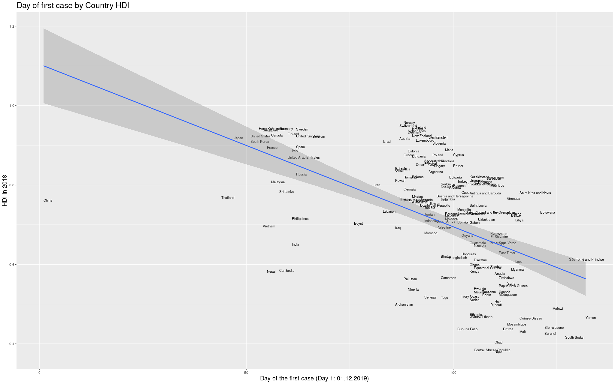
I started by taking from Wikipedia the
List of countries by Human Development Index.
Of course, what counts as a “country” is a little complicated,
and depending on how I count I can get slightly different
results, but I will assume this wouldn’t change qualitatively
my results here.
Then I tried to find the date of arrival of the Coronavirus in
each country. This was a little hard to find: the internet is
currently flooded with news and websites showing the development
of the disease, and the data is super disorganized and spread
over so many pages and websites. I eventually, after quite some
browsing, found the Wikipedia
2019-20 Coronavirus Pandemic by Country and Territory.
I like that they at least say “and territory”, not to be too
politically incorrect: the list is flooded with “unrecognized
regions”.
This was the best I could find, so it will have to do.
The table is in a hard-to-process format, but after some fiddling
I managed to transform it into a CSV that did the job. The
reason why I’m mentioning this here is because I am afraid I
might end up missing a few countries, but hopefully this won’t
be that bad.
Without further ado… I merged the two datasets, and produced
the following graph:
 Click here for the full image
I wanted to make it more explicit which countries are in which
continent. I thought some color would help. I got the data for
the continents from another Wikipedia article:
List of countries by population (United Nations).
I still decided to show the previous graph in case I lost data
with the merge between the data I had used so far and the data
I got for the colors. So, here is the same graph as before, with
colors by continent. (Importantly, I refuse to call my continent
“Americas”, so I renamed it to its real name, the singular,
America.)
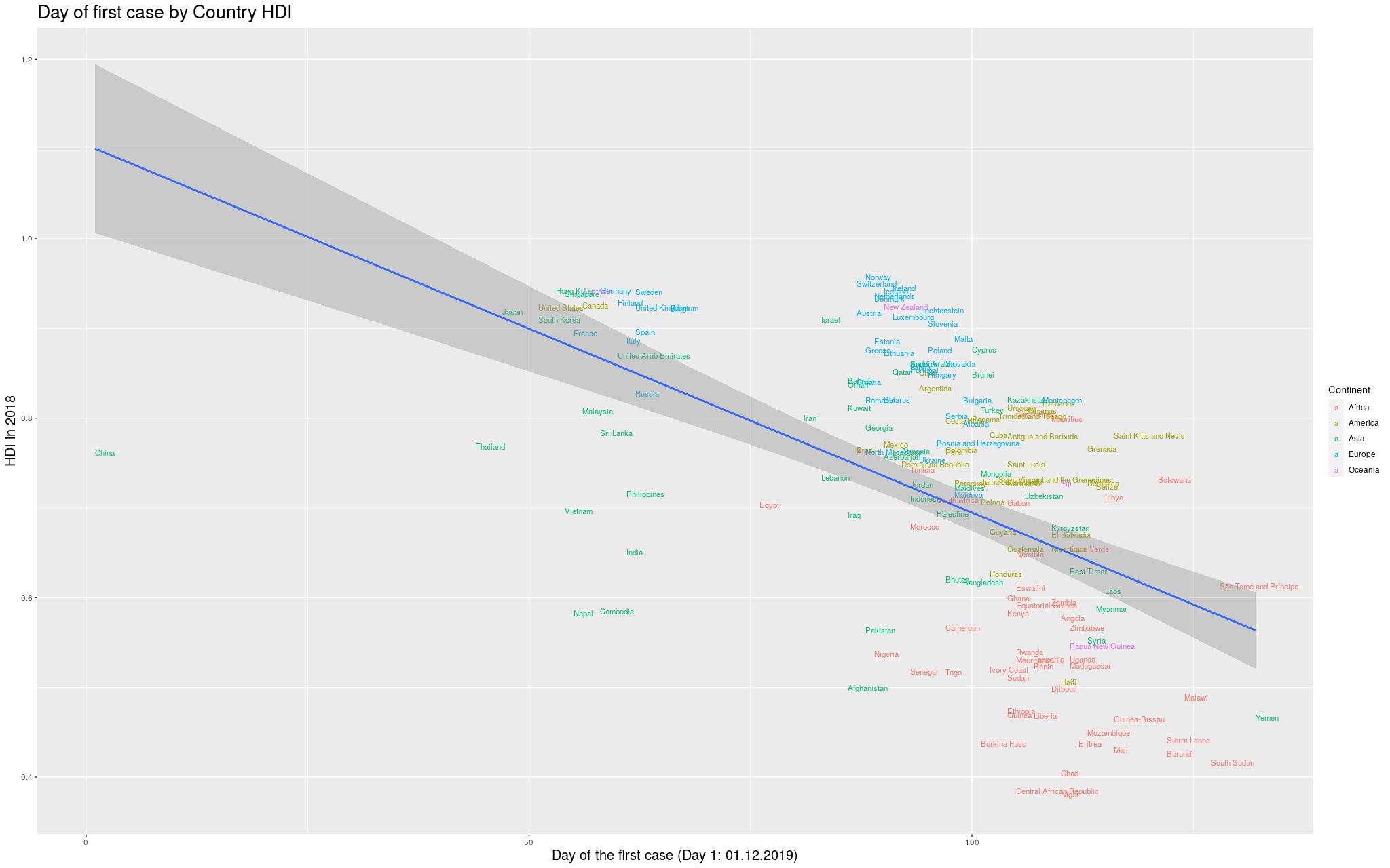 Click here for the full image
Finally… because the disease took so long to
get out of China, you can see that the delay more or less
“skews” the trend line. In
fancy words, that China point there breaks the assumption of
heteroskedasticity of the regression, and I’d like to fix that.
In the
following graph, I removed China, so that we could see better
how the trend line would look like:
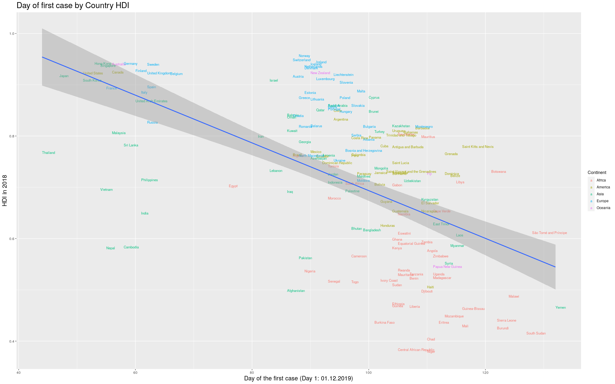 Click here for the full image
I was impressed with how consistent the results were throughout this
exploration: in whichever level you look, the more developed a
place, the earlier the virus arrived. I am curious if other
good predictors like this one will arise in the future.
I hope to have convinced the reader that this is a good
predictor. Of course it is not the whole story, but I do think
my playing with the data brought up some nice insights.
Hopefully, this was an interesting exploration of the data as
it is available in the internet. I am positively surprised with
how easy it was to manipulate all this data.
If you happen to use these graphs, I’d be thankful if you
point to my blog =) I’m just a random person on the internet
playing with data.
22 Jul 2018
This blog post has a somewhat different target public: instead of focusing on the Machine Learning practician, it targets the Cognitive Science student who often uses Regression in his everyday statistics without understanding well how it works. Of course, there is a lot more to say than what is written here, but hopefully it will be a good basis upon which to build.
The
Psycholinguistics group of the University of Kaiserslautern,
where I am currently a PhD student, offered a course on Computational
Linguistics this last Summer Semester, where I had the opportunity
to give three classes. I ended up writing a lot of material on Linear Regression
(and some other stuff) that I believe would be beneficial not only for the
students of the class, but for anyone else interested in the topic. So, well,
this is the idea of this blog post…
In the class, we used Python to (try to) make things more “palpable” to the
students. I intend to do the exact same here. In fact, I am using
jupyter notebook for the first time along with this blog (if you are reading
this published, it is because it all went well). My goal with the Python codes
below is to make the ideas implementable also by the interested reader. If you
can’t read Python, you should still be able to understand what is going on by
just ignoring (most of) the code. Notice that most of the code blocks is
organized in two parts: (1) the part that has code, which is normally colorful,
highlighting the important Python words; and (2) the part that has the output,
which is normally just grey. Sometimes the code will also output an image
(which is actually the interesting thing to look at).
Still… for those interested in the Python, the following code loads the
libraries I am using throughout this blog post:
# If you get a "No module named 'matplotlib'" error, you might have to
# install matplotlib before running this line. To do so, go to the
# terminal, activate your virtual environment, and then run
#
# pip install matplotlib

import matplotlib.pyplot as plt
from matplotlib import cm
from mpl_toolkits.mplot3d import axes3d
import pylab

# You might also need to install numpy. Same thing:
# pip install numpy
import numpy as np

# The same is true for sklearn:
# pip install sklearn
import sklearn
from sklearn import linear_model
Example Dataset
To make this easier to understand, we will create a very simple dataset. In this fictitious dataset, different participants read some sentences and had their eye tracked by a camera in front of them. Then, some parameters related to their readings were recorded.
Say our data looks like the following…
(notice that this data is COMPLETELY FICTITIOUS and probably DOES NOT reflect reality!)
# Generates some fictitious data

columns = ["gender",
           "mean_pupil_dilation",
           "total_reading_time",
           "num_fixations"]

data = [
    ['M',  0.90,  120,  20],
    ['F',  0.89,  101,  18],
    ['M',  0.79,  104,  24],
    ['F',  0.91,  111,  19],
    ['F',  0.77,   95,  20],
    ['F',  0.63,   98,  22],
    ['M',  0.55,   77,  30],
    ['M',  0.60,   80,  23],
    ['M',  0.55,   67,  56],
    ['F',  0.54,   63,  64],
    ['M',  0.45,   59,  42],
    ['M',  0.44,   57,  43],
    ['F',  0.40,   61,  51],
    ['F',  0.39,   66,  40]
]

test_data = [
    ['M',  0.87,  102,  17],
    ['F',  0.74,  101,  12],
    ['M',  0.42,   60,  52],
    ['F',  0.36,   54,  44]
]
For the non-Python readers, this dataset is basically composed of the following two tables.
- A Training Data (which will be normally referred to as
data in the codes below)
| Gender |
Mean Pupil Dilation |
Total Reading Time |
Num Fixations |
| M |
0.90 |
120 |
20 |
| F |
0.89 |
101 |
18 |
| M |
0.79 |
104 |
24 |
| F |
0.91 |
111 |
19 |
| F |
0.77 |
95 |
20 |
| F |
0.63 |
98 |
22 |
| M |
0.55 |
77 |
30 |
| M |
0.60 |
80 |
23 |
| M |
0.55 |
67 |
56 |
| F |
0.54 |
63 |
64 |
| M |
0.45 |
59 |
42 |
| M |
0.44 |
57 |
43 |
| F |
0.40 |
61 |
51 |
| F |
0.39 |
66 |
40 |
- And a Test Data (
test_data in the codes below)
| Gender |
Mean Pupil Dilation |
Total Reading Time |
Num Fixations |
| M |
0.87 |
102 |
17 |
| F |
0.74 |
101 |
12 |
| M |
0.42 |
60 |
52 |
| F |
0.36 |
54 |
44 |
Why do you have these two tables instead of one?
I won’t go into details here, but the way things work in Machine Learning is that
you normally “train a model” using the Training Data and then you use this
model to try to predict the values in the Test Data. This way you can make sure
that your model is capable of predicting values from data that it has never seen.
In this blog post I won’t actually use the Test Data, but I thought it made sense
to show it here so that the reader keeps in mind that this is the way he would
actually check if the Regression model that is learnt below is capable of
generalizing to new data, that has never been used before.
Defining Regression
If you look at our data, you will see that there seems to be a relation between the dilation of the pupil of a participant and his reading time. That is, a participant with high dilation seems to have longer reading times than a participant with low dilation. It might make sense, then, to pose the following question: is it possible to guess more or less the mean_pupil_dilation from the total_reading_time? Guessing the value of a continuous variable from the value of other continuous variables is what is known in Machine Learning as Regression.
In more formal terms, we will define Regression as follows. Given:
- An input space $I$.
- A dataset containing pairs $(d_i, l_i),~~i=1, \ldots, k$, where $d_i \in I$ and $l_i \in \mathbb{R}$.
Our goal was then to find a model $f: I \rightarrow \mathbb{R}$ that, given a new (unseen) $d$, is capable of predicting its correct $l$ (i.e., $f(d) = l$).
So… first thing… let’s plot mean_pupil_dilation and total_reading_time to see how they look like:
# Gets the data
# (the `astype()` call is because Python was taking the numbers as strings)
mean_pupil_dilation = np.array(data)[:, 1].astype(float)
total_reading_time  = np.array(data)[:, 2].astype(float)

# Let's show the data here too
print("mean_pupil_dilation", mean_pupil_dilation)
print("total_reading_time", total_reading_time)

# Creates the canvas
fig, axes = plt.subplots()

# Really plots the data
axes.plot(mean_pupil_dilation, total_reading_time, 'o')

# Puts names in the two axes (just for clearness)
axes.set_xlabel('Mean Pupil Dilation')
axes.set_ylabel('Total Reading Time')

pylab.xlim([0,1])
pylab.ylim([15, 125])
mean_pupil_dilation [0.9  0.89 0.79 0.91 0.77 0.63 0.55 0.6  0.55 0.54 0.45 0.44 0.4  0.39]
total_reading_time [120. 101. 104. 111.  95.  98.  77.  80.  67.  63.  59.  57.  61.  66.]
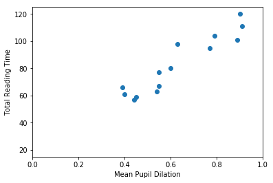
It should be quite visible that you can have a good guess (from this data) of one of the values based on the other. That is, that you can guess the Total Reading Time based on the Mean Pupil Dilation
In this first example, our goal is to find a function that crosses all dots in the graph above. That is, this function should, for the values of mean_pupil_dilation that we know, have the values of total_reading_time in our dataset (or be the closest possible to them). We will also assume that this function is “linear”. That is, we assume that it is possible to find a single straight line that works as a soluton for our problem.
With these assumptions in hand, we can now define this problem in a more formal way. A line can be always described by the function $y = Ax + b$, where the $A$ is referred to as the slope, and $b$ is normally called the intercept (because it is where the line intercepts the $y$-axis when $x = 0$). In our case, the points that we already know about the line are going to help us to decide how this line is supposed to look like. That is:
\[\begin{cases}
66 &= A \cdot 0.39 &+ b \\
61 &= A \cdot 0.4 &+ b \\
57 &= A \cdot 0.44 &+ b \\
59 &= A \cdot 0.45 &+ b \\
63 &= A \cdot 0.54 &+ b \\
67 &= A \cdot 0.55 &+ b \\
80 &= A \cdot 0.6 &+ b \\
77 &= A \cdot 0.55 &+ b \\
98 &= A \cdot 0.63 &+ b \\
95 &= A \cdot 0.77 &+ b \\
111 &= A \cdot 0.91 &+ b \\
104 &= A \cdot 0.79 &+ b \\
101 &= A \cdot 0.89 &+ b \\
120 &= A \cdot 0.9 &+ b \\
\end{cases}\]
The equations above came directly from our table above. For one of the participants, when total_reading_time is 66, the mean_pupil_dilation is 0.39. For the next, when the total_reading_time is 61, the mean_pupil_dilation is 0.4. We make the total_reading_time the $y$ of our equation (the value that we want to predict), and it is predicted by a transformation of the mean_pupil_dilation (our $x$).
Of course, you don’t need to be a genius to realize that this system of equations has no solution (that is, that no straight line will actually cross all the points in our graph). So, our goal is to find the best line that gets the closest possible to all points we know. To indicate this in our equations, we insert a variable that stands for the “error”.
\[\begin{cases}
66 &= A \cdot 0.39 &+ b + \epsilon_1 \\
61 &= A \cdot 0.4 &+ b + \epsilon_2 \\
57 &= A \cdot 0.44 &+ b + \epsilon_3 \\
59 &= A \cdot 0.45 &+ b + \epsilon_4 \\
63 &= A \cdot 0.54 &+ b + \epsilon_5 \\
67 &= A \cdot 0.55 &+ b + \epsilon_6 \\
80 &= A \cdot 0.6 &+ b + \epsilon_7 \\
77 &= A \cdot 0.55 &+ b + \epsilon_8 \\
98 &= A \cdot 0.63 &+ b + \epsilon_9 \\
95 &= A \cdot 0.77 &+ b + \epsilon_{10} \\
111 &= A \cdot 0.91 &+ b + \epsilon_{11} \\
104 &= A \cdot 0.79 &+ b + \epsilon_{12} \\
101 &= A \cdot 0.89 &+ b + \epsilon_{13} \\
120 &= A \cdot 0.9 &+ b + \epsilon_{14} \\
\end{cases}\]
Now… this notation is quite cluttered with lots of variables that repeat a lot. People who actually do this normally prefer to write this with matrices. The following equation means exactly the same:
\[\begin{bmatrix}
66 \\ 61 \\ 57 \\ 59 \\ 63 \\ 67 \\ 80 \\ 77 \\ 98 \\ 95 \\ 111 \\ 104 \\ 101 \\ 120
\end{bmatrix}
= A
\begin{bmatrix}
0.39 \\ 0.4 \\ 0.44 \\ 0.45 \\ 0.54 \\ 0.55 \\ 0.6 \\ 0.55 \\ 0.63 \\ 0.77 \\ 0.91 \\ 0.79 \\ 0.89 \\ 0.9
\end{bmatrix}
+ b +
\begin{bmatrix}
\epsilon_{1} \\ \epsilon_{2} \\ \epsilon_{3} \\ \epsilon_{4} \\ \epsilon_{5} \\ \epsilon_{6} \\ \epsilon_{7} \\
\epsilon_{8} \\ \epsilon_{9} \\ \epsilon_{10} \\ \epsilon_{11} \\ \epsilon_{12} \\ \epsilon_{13} \\ \epsilon_{14} \\
\end{bmatrix}\]
Finally… we often replace the vectors by bold letters and just write it as:
\[\mathbf{y} = A\mathbf{x} + b + \boldsymbol{\epsilon}\]
Our goal is, then, for each of the equations above, to find values of $A$ and $b$ such that the $\epsilon_i$ (i.e., the error) associated with that equation is the minimum possible.
Evaluating a Regression solution
Now… there is a literally infinite number of possible lines, and we need to find a way to evaluate them, that is, decide if we like a certain line more than the others. For this, we probably should use the errors (i.e., the $\boldsymbol{\epsilon}$): lines that have big errors should be discarded, and lines that have low errors should be preferred. Unfortunately, there are several ways to “put together” all the $\epsilon_i$ denoting the errors associated with a given line. One way to “put together” all these $\epsilon_i$ could be summing them all:
\[\text{Error over all equations: } \\E_{naïve} = \sum_i{\epsilon_i}\]
However, you might have guessed by the word “naïve” there that this formula has
problems. The problem with this formula the following: that, when some points are
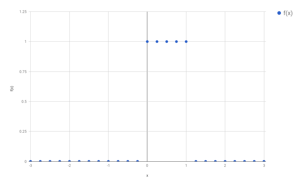
above and some points are below the line, the errors will “cancel” each other.
For example, in the image below, the line does not cross any of the data points,
but still produces an $E_{naïve} = 0$. How?
The line passes at a distance of exactly 1 from the first five data points,
producing a positive error (because the points are above the line) of 1 for each
of them; but also passes at a distance of exactly 5 from the sixth data point,
producing a negative error (because the point is below the line) of -5. When you
sum up everything, you get $E_{naïve} = 1 + 1 + 1 + 1 + 1 - 5 = 0$.
X = [1,2,3,4,5,6]
Y_line = np.array([1,2,3,4,5,6])
Y_dots = np.array([2,3,4,5,6,1])

plt.plot(X, Y_line)
plt.plot(X, Y_dots, 'ro')
[<matplotlib.lines.Line2D at 0x7f1515f17b70>]
One solution to this problem could be to simply use the absolute value of each
$\epsilon$ when calculating the error value:
\[\text{Error over all equations: } \\E_{L_1} = \sum_i{\mid\epsilon_i\mid} = \|\boldsymbol{\epsilon}\|_1\]
This is a commonly used formula for evaluating the quality of a regression curve. Summing the magnitude of each $\epsilon$ this way is referred to as calculating the $L_1$ norm of the $\epsilon$ vector.
Unfortunately, the absolute-value function is not differentiable everywhere in its domain (that is, the derivative of this function is not defined at the point when $x = 0$ – if you don’t know what derivative or differentiation is, don’t worry, this is not super crucial for understanding the rest). This is not a terrible problem, but we are going to need differentiation later, and a great alternative function that doesn’t have this problem is the $L_2$ norm:
\[\text{Error over all equations: } \\E_{L_2} = \sum_i{ {\epsilon_i}^2} = \|\boldsymbol{\epsilon}\|_2 \\
\text{(}\textit{i.e.}\text{, the Sum of Squared Errors)}\]
The code below shows each of the alternative errors for the simple example above,
where, as we saw, the $E_{naïve} = 0$.
# (Following the example immediately above)

# Calculating the error in a very naive way
print("Error naive: ", np.sum(Y_dots - Y_line))

# Calculating the error using the absolute value of the epsilons:
print("Error L1:    ", np.sum(np.absolute(Y_dots - Y_line)))

# Calculating the error using the absolute value of the epsilons:
print("Error L2:    ", np.sum((Y_dots - Y_line)**2))
Error naive:  0
Error L1:     10
Error L2:     30
This last function (the $E_{L_2}$) is the usual choice for evaluating the Regression line. It is differentiable everywhere, but is not so robust to outliers as the $L_1$ norm.
Motivating Gradient Descent (a method to find the best line)
In the sections above, we have defined what we want to get: a good line – hopefully, the best one – that (almost) crosses all the points in our dataset. We have also understood how to decide if a line is good or not, based on the errors between the value predicted by the line and the value that appears in our data.
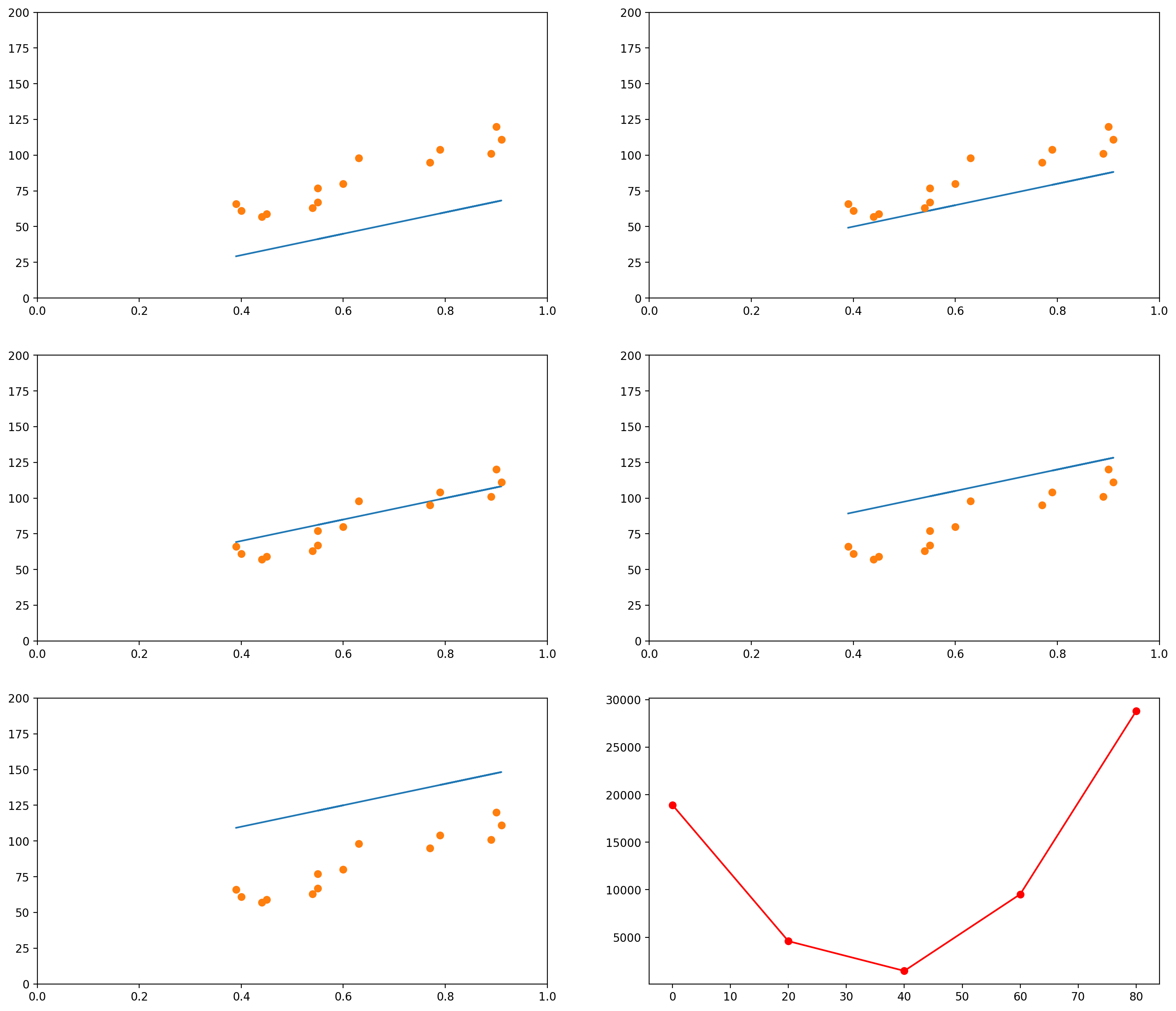
The images below show several possible lines, with an intercept of 0 and slopes 10, 30, 50, 100 and 200. The last graph shows the Sum of Squared Errors (the $L_2$ norm of the error vector $\epsilon$) for each of the lines:
# This is the original data
data_x = mean_pupil_dilation
data_y = total_reading_time

# Let's create some possible lines
plot_x1 = mean_pupil_dilation
plot_y1 = 10*plot_x1 + 0

plot_x2 = mean_pupil_dilation
plot_y2 = 30*plot_x2 + 0

plot_x3 = mean_pupil_dilation
plot_y3 = 50*plot_x3 + 0

plot_x4 = mean_pupil_dilation
plot_y4 = 100*plot_x4 + 0

plot_x5 = mean_pupil_dilation
plot_y5 = 200*plot_x5 + 0

# Now let's plot these lines, along with the data
def plot_line_and_dots(line, dots, lims):
    line_x, line_y = line
    dots_x, dots_y = dots
    xlim, ylim = lims
    plt.plot(line_x, line_y)
    plt.plot(dots_x, dots_y, 'o')
    plt.xlim(xlim)
    plt.ylim(ylim)

plt.figure(figsize=(18, 16), dpi= 200)

plt.subplot(3,2,1)
plot_line_and_dots([plot_x1, plot_y1], [data_x, data_y], [[0,1],[0, 200]])

plt.subplot(3,2,2)
plot_line_and_dots([plot_x2, plot_y2], [data_x, data_y], [[0,1],[0, 200]])

plt.subplot(3,2,3)
plot_line_and_dots([plot_x3, plot_y3], [data_x, data_y], [[0,1],[0, 200]])

plt.subplot(3,2,4)
plot_line_and_dots([plot_x4, plot_y4], [data_x, data_y], [[0,1],[0, 200]])

plt.subplot(3,2,5)
plot_line_and_dots([plot_x5, plot_y5], [data_x, data_y], [[0,1],[0, 200]])

# Finally, in the last plot, let's look at the error between the

squared_errors1 = (plot_y1 - total_reading_time)**2
squared_errors2 = (plot_y2 - total_reading_time)**2
squared_errors3 = (plot_y3 - total_reading_time)**2
squared_errors4 = (plot_y4 - total_reading_time)**2
squared_errors5 = (plot_y5 - total_reading_time)**2

plt.subplot(3,2,6)
plt.plot([10, 30, 50, 100, 200],
         [sum(squared_errors1),
          sum(squared_errors2),
          sum(squared_errors3),
          sum(squared_errors4),
          sum(squared_errors5)], '-ro')
[<matplotlib.lines.Line2D at 0x7f1515d61a90>]
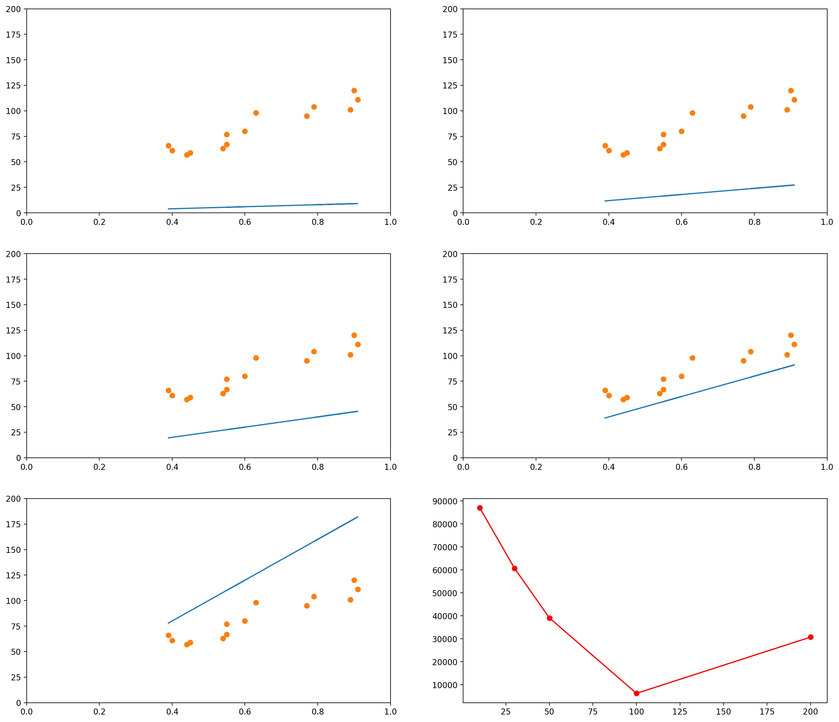
As you can see, when the slope is 10 (the first graph, and the leftmost data point in the last graph), the $L_2$ norm of the error vector is very high. As the slope keeps increasing, the error goes on decreasing, until a certain moment (somewhere between the slopes 100 and 200), when it increases again.
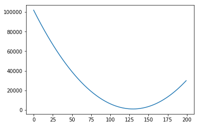
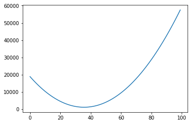
We could plot the Sum of Squared errors of many many of these lines, and we would get a function that looks like the following:
# Initialize an empty list
error_l2_norms = []

for i in range(200):
    # Gets the y values of the line, given the slope i
    plot_y1 = i*plot_x1 + 0
    # Calculates the sum of squared errors for all the data points we have
    sum_squared_errors = sum((plot_y1 - total_reading_time)**2)
    # Inserts the sum in our list
    error_l2_norms.append(sum_squared_errors)

# Now we plot the 200 elements of the list, along with the sum of squared errors
plt.plot(range(200), error_l2_norms)
[<matplotlib.lines.Line2D at 0x7f151446d898>]
Notice that so far we only moved the slope. We could do the same with the intercept. For example, let’s say we fixed our slope in 75. Then we could generate graphs with intercepts, say, 0, 20, 40, 60, 80:
# This is the original data
data_x = mean_pupil_dilation
data_y = total_reading_time
slope = 75

# Let's create some possible lines
plot_x1 = mean_pupil_dilation
plot_y1 = slope*plot_x1 + 0

plot_x2 = mean_pupil_dilation
plot_y2 = slope*plot_x2 + 20

plot_x3 = mean_pupil_dilation
plot_y3 = slope*plot_x3 + 40

plot_x4 = mean_pupil_dilation
plot_y4 = slope*plot_x4 + 60

plot_x5 = mean_pupil_dilation
plot_y5 = slope*plot_x5 + 80

plt.figure(figsize=(18, 16), dpi= 200)

plt.subplot(3,2,1)
plot_line_and_dots([plot_x1, plot_y1], [data_x, data_y], [[0,1],[0, 200]])

plt.subplot(3,2,2)
plot_line_and_dots([plot_x2, plot_y2], [data_x, data_y], [[0,1],[0, 200]])

plt.subplot(3,2,3)
plot_line_and_dots([plot_x3, plot_y3], [data_x, data_y], [[0,1],[0, 200]])

plt.subplot(3,2,4)
plot_line_and_dots([plot_x4, plot_y4], [data_x, data_y], [[0,1],[0, 200]])

plt.subplot(3,2,5)
plot_line_and_dots([plot_x5, plot_y5], [data_x, data_y], [[0,1],[0, 200]])

# Finally, in the last plot, let's look at the error between the

squared_errors1 = (plot_y1 - total_reading_time)**2
squared_errors2 = (plot_y2 - total_reading_time)**2
squared_errors3 = (plot_y3 - total_reading_time)**2
squared_errors4 = (plot_y4 - total_reading_time)**2
squared_errors5 = (plot_y5 - total_reading_time)**2

plt.subplot(3,2,6)
plt.plot([0, 20, 40, 60, 80],
         [sum(squared_errors1),
          sum(squared_errors2),
          sum(squared_errors3),
          sum(squared_errors4),
          sum(squared_errors5)], '-ro')
[<matplotlib.lines.Line2D at 0x7f151437a4e0>]
Of course, again, we could plot the errors of curves for many other values of intercept:
# Initialize an empty list
error_l2_norms = []
slope = 75

for i in range(100):
    # Gets the y values of the line, given the slope i
    plot_y1 = slope*plot_x1 + i
    # Calculates the sum of squared errors for all the data points we have
    sum_squared_errors = sum((plot_y1 - total_reading_time)**2)
    # Inserts the sum in our list
    error_l2_norms.append(sum_squared_errors)

plt.plot(range(100), error_l2_norms)
[<matplotlib.lines.Line2D at 0x7f1514243198>]
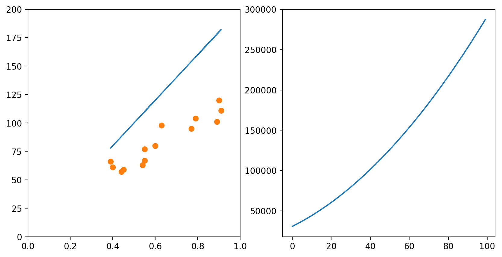
In each of the graphs above, we fixed a value for one of the variables (either the intercept or the slope) and iterated through many possible values of the other variable. It is important to notice that, as one of the variables change, the curve for the other variable also changes. In the example above, we had chosen a slope of 75. The example below shows what happens when we use a slope of 200. The graph to the left has an intercept of 0; the graph to the right shows how the error change as the intercept increases from 0 to 100.
slope = 200

# Change the default size of the plotting
plt.figure(figsize=(10, 5), dpi= 200)

plot_x = mean_pupil_dilation
plot_y = slope*plot_x5 + 0
plt.subplot(1,2,1)
plot_line_and_dots([plot_x, plot_y], [data_x, data_y], [[0,1],[0, 200]])

# Initialize an empty list
error_l2_norms = []

for i in range(100):
    # Gets the y values of the line, given the slope i
    plot_y1 = slope*plot_x1 + i
    # Calculates the sum of squared errors for all the data points we have
    sum_squared_errors = sum((plot_y1 - total_reading_time)**2)
    # Inserts the sum in our list
    error_l2_norms.append(sum_squared_errors)

# Now we plot the 100 elements of the list, along with the sum of squared errors
plt.subplot(1,2,2)
plt.plot(range(100), error_l2_norms)
[<matplotlib.lines.Line2D at 0x7f1515de7c18>]
Of course, if one had time, one could try all possible combinations of slope and intercept and choose the best one. This would generate a surface in the 3D space:
# Initialize an empty list
error_l2_norms = np.zeros([100, 100])

for i in range(100):
    for slope in range(100):
        # Gets the y values of the line, given the slope i
        plot_y1 = slope*plot_x1 + i
        # Calculates the sum of squared errors for all the data points we have
        sum_squared_errors = sum((plot_y1 - total_reading_time)**2)
        # Inserts the sum in our list
        error_l2_norms[i, slope] = sum_squared_errors

X = np.arange(0, 100, 1)
Y = np.arange(0, 100, 1)
X, Y = np.meshgrid(X, Y)
Z = error_l2_norms

fig = plt.figure()
ax = fig.gca(projection='3d')
ax.set_xlabel('Intercept')
ax.set_ylabel('Slope')
ax.set_zlabel('Sum of Squared Errors')
surf = ax.plot_surface(X, Y, Z, cmap=cm.coolwarm, rstride=10, cstride=10)
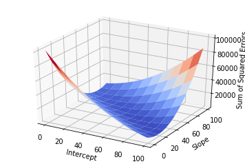
But this approach would be too computationally intensive, and if you had more variables it would probably take too long.
Enter Gradient Descent
To solve this problem in an easy way, we use Gradient Descent. We will first
understand the intuition of Gradient Descent, and then I will show the maths.
Using our example above, let’s focus on what Gradient Descent would do if we had the two variables Intercept and Slope and wanted to find the best configuration of Intercept and Slope (i.e., the configuration for which the error is minimum). Gradient Descent would start with any random configuration. Then, given this configuration, it would ask:
- In which direction (and how ‘strongly’) do I need to change my Intercept so that my error would increase?”
In more fancy mathy terms, it would calculate the derivative of the error function (the surface plotted above) with respect to the variable Intercept. It would then keep this “direction” in a variable.
At the same time, it would also ask:
- In which direction (and how ‘strongly’) do I need to change my Slope so that my error would increase?”
Again, this is the same as calculating the derivative of the error function with respect to the Slope. It would then also store this “direction” in a variable.
Finally, it would take the current Intercept and Slope and update them using the values it just calculated. But there is a catch: since it calculated the direction in which the error would increase, it updates the two variables in the opposite direction.
Now we are ready to understand the formal notation for the algorithm. Remember
that our error function is the Sum of Squared Errors, also referred to as the
$L_2$-norm of the error vector $\boldsymbol{\epsilon}$, and that this $L_2$-norm
is normally written as $| \cdot |_2$. That is, the $L_2$-norm of
$\boldsymbol{\epsilon}$ is normally written $| \boldsymbol{\epsilon} |_2$.
Proceeding, we want to represent the derivative of the error function with respect to the variables Intercept (which we were referring to as $A$) and Slope (which we were referring to as $b$). These derivatives are normally written as
\[\frac{\partial \|\boldsymbol{\epsilon}\|_2}{\partial A}
\text{ and }
\frac{\partial \|\boldsymbol{\epsilon}\|_2}{\partial b}\]
Notice that the error function $| \boldsymbol{\epsilon} |_2$ depends exclusively on these two variables. This leads us to the concept of “Gradient”. The Gradient of the error function is a vector containing the derivative of each of the variables on which it depends. Since $|\boldsymbol{\epsilon}|_2$ depends only on $A$ and $b$, the Gradient of $|\boldsymbol{\epsilon}|_2$ (we represent it by $\nabla |\boldsymbol{\epsilon}|_2$) is the following vector:
\[\nabla \|\boldsymbol{\epsilon}\|_2 =
\Big(\frac{\partial \|\boldsymbol{\epsilon}\|_2}{\partial A}
,
\frac{\partial \|\boldsymbol{\epsilon}\|_2}{\partial b}\Big)\]
After calculating the value of the Gradient, we can just update the value of $A$ and $b$ accordingly:
\[A \leftarrow A - \lambda \cdot \frac{\partial \|\boldsymbol{\epsilon}\|_2}{\partial A}
\\
b \leftarrow b - \lambda \cdot \frac{\partial \|\boldsymbol{\epsilon}\|_2}{\partial b}\]
The $\lambda$ there is the “learning rate”. It is just a number multiplying each
of the elements of the Gradient. The idea is that it might make sense to make smaller
or bigger jumps if you know you are too close or too far away from a good configuration
of parameters.
Problems with Gradient Descent
The Gradient Descent procedure will normally help us find a so-called “local minimum”:
a solution that is better than all solutions nearby. Consider, however, the graph below:
# Defines (x,y) coordinates for many points for the curve
x = np.linspace(-30, 10, 200)
y = np.sin(0.5*x) + .3*x + .01*x**2

# Plots the (x,y) coordinates defined above
plt.plot(x, y)

# Plots a red dot at the point x=3
plt.plot([3], [np.sin(0.5*3) + .3*3 + .01*3**2], 'ro')
[<matplotlib.lines.Line2D at 0x7f15141414e0>]
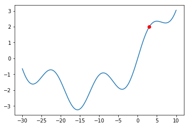
What would happen if we were at the red dot and used Gradient Descent to find a solution?
The algorithm might get stuck in the local minimum immediately to its right (near $x = -5$),
and never manage to find the global minimum (around $x = 15$). You should always keep this
in mind when using Gradient Descent.
Even though there might be shortcomings to Gradient Descent, this is the method used in a
lot of Machine Learning problems, and this is why I am introducing it here. The problem of
Linear Regression is very often a “convex optimization problem”, which means it doesn’t have
those local minima above.
Of course, the same concepts can be applied when you have more than one variables and you would like to predict the value of another variable. For example, let’s say we now had both the mean_pupil_dilation and the number of fixations (num_fixations below) and we wanted to predict the total_reading_time. In the code below, we will put these values in convenient data structures:
# This was how we had taken the variables separately
mean_pupil_dilation = np.array(data)[:, 1].astype(float)
total_reading_time  = np.array(data)[:, 2].astype(float)
num_fixations = np.array(data)[:, 3].astype(float)

# We can use the `zip()` function to put them all together again
# `zip()` returns a generator... so we use `list()` to transform it into a list
dilation_fixations = list(zip(mean_pupil_dilation, num_fixations))
print("mean_pupil_dilation", mean_pupil_dilation)
print("--")
print("num_fixations", num_fixations)
print("--")
print("dilation_fixations", dilation_fixations)
mean_pupil_dilation [0.9  0.89 0.79 0.91 0.77 0.63 0.55 0.6  0.55 0.54 0.45 0.44 0.4  0.39]
--
num_fixations [20. 18. 24. 19. 20. 22. 30. 23. 56. 64. 42. 43. 51. 40.]
--
dilation_fixations [(0.9, 20.0), (0.89, 18.0), (0.79, 24.0), (0.91, 19.0), (0.77, 20.0), (0.63, 22.0), (0.55, 30.0), (0.6, 23.0), (0.55, 56.0), (0.54, 64.0), (0.45, 42.0), (0.44, 43.0), (0.4, 51.0), (0.39, 40.0)]
Let’s also plot the data in 3D, to get a notion of how it looks like (it is the same data… even though it might not seem the same at a first glance).
fig = plt.figure()
ax = fig.add_subplot(111, projection='3d')

ax.scatter(total_reading_time, mean_pupil_dilation, num_fixations)
ax.set_xlabel('Total Reading Time')
ax.set_ylabel('Mean Pupil Dilation')
ax.set_zlabel('Number of Fixations')
Text(0.5,0,'Number of Fixations')
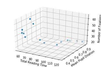
So now, with two input dimensions and one output dimension, we don’t only have a line, characterized by a single slope and a single intercept, but a plane, characterized by 3 variables: one intercept and two coefficients.
In the sections above, our line equation looked like this:
\[\mathbf{y} = A\mathbf{x} + b + \boldsymbol{\epsilon} \\\]
Where $A$ was a scalar (a number) and $\mathbf{x}$ was a column vector. That is, the equation looked like this:
\[\begin{bmatrix}
y_1 \\ y_2 \\ \vdots \\ y_n
\end{bmatrix} = A
\begin{bmatrix}
x_1 \\
x_2 \\
\vdots \\
x_n
\end{bmatrix}
+ b +
\begin{bmatrix}
\epsilon_1 \\
\epsilon_2 \\
\vdots \\
\epsilon_n
\end{bmatrix}\]
Now, instead of having only one $A$, we have two values: $A_1$ and $A_2$. The first value, $A_1$, should be multiplied by the pupil dilation; and the second value, $A_2$, should be multiplied by the number of fixations.
To make this equation function exactly in the same way as before, we can write it like this:
\[\begin{bmatrix}
y_1 \\ y_2 \\ \vdots \\ y_n
\end{bmatrix} = \begin{bmatrix}A_1 & A_2 \end{bmatrix}
\begin{bmatrix}
x_{11} & x_{12} \\
x_{21} & x_{22} \\
\vdots & \vdots \\
x_{n1} & x_{n2}
\end{bmatrix}^{\top}
+ b +
\begin{bmatrix}
\epsilon_1 \\
\epsilon_2 \\
\vdots \\
\epsilon_n
\end{bmatrix}\]
Of course, if you had more variables, you could just add more columns to the $A$ matrix and to the $\mathbf{x}$ matrix. For example, if you had $m$ variables, you would have:
\[\begin{bmatrix}
y_1 \\ y_2 \\ \vdots \\ y_n
\end{bmatrix} = \begin{bmatrix}A_1 & A_2 & \cdots & A_m \end{bmatrix}
\begin{bmatrix}
x_{11} & x_{12} & \cdots & x_{1m} \\
x_{21} & x_{22} & \cdots & x_{2m} \\
\vdots & \vdots & \ddots & \vdots \\
x_{n1} & x_{n2} & \cdots & x_{nm}
\end{bmatrix}^{\top}
+ b +
\begin{bmatrix}
\epsilon_1 \\
\epsilon_2 \\
\vdots \\
\epsilon_n
\end{bmatrix}\]
So, putting the numbers in place, remember that we had the following two vectors:
- Pupil dilations: $\begin{bmatrix}0.9 & 0.89 & 0.79 & 0.91 & 0.77 & 0.63 & 0.55 & 0.6 & 0.55 & 0.54 & 0.45 & 0.44 & 0.4 & 0.39\end{bmatrix}$
- Number of fixations: $\begin{bmatrix}20 & 18 & 24 & 19 & 20 & 22 & 30 & 23 & 56 & 64 & 42 & 43 & 51 & 40 \end{bmatrix}$
Then our equation would become:
\[\begin{bmatrix}
66 \\ 61 \\ 57 \\ 59 \\ 63 \\ 67 \\ 80 \\ 77 \\ 98 \\ 95 \\ 111 \\ 104 \\ 101 \\ 120
\end{bmatrix} = \begin{bmatrix} A_1 & A_2 \end{bmatrix}
\begin{bmatrix}
0.9 & 20 \\
0.89 & 18 \\
0.79 & 24 \\
0.91 & 19 \\
0.77 & 20 \\
0.63 & 22 \\
0.55 & 30 \\
0.6 & 23 \\
0.55 & 56 \\
0.54 & 64 \\
0.45 & 42 \\
0.44 & 43 \\
0.4 & 51 \\
0.39 & 40 \\
\end{bmatrix}^{\top}
+ b + \boldsymbol{\epsilon}\]
Just to make it clear, that “$\top$” over the matrix containing our numbers
indicates that the matrix was transposed. You could rewrite the equation as:
\[\begin{bmatrix}
66 \\ 61 \\ 57 \\ 59 \\ 63 \\ 67 \\ 80 \\ 77 \\ 98 \\ 95 \\ 111 \\ 104 \\ 101 \\ 120
\end{bmatrix} = \\ \begin{bmatrix} A_1 & A_2 \end{bmatrix}
\begin{bmatrix}
0.9 & 0.89 & 0.79 & 0.91 & 0.77 & 0.63 & 0.55 & 0.6 & 0.55 & 0.54 & 0.45 & 0.44 & 0.4 & 0.39 \\
20 & 18 & 24 & 19 & 20 & 22 & 30 & 23 & 56 & 64 & 42 & 43 & 51 & 40
\end{bmatrix} + b + \boldsymbol{\epsilon}\]
Then our gradient descent does exactly the same. We first calculate the gradient of the error function, which now is composed by three elements:
\[\nabla \|\boldsymbol{\epsilon}\|_2 =
\Big(\frac{\partial \|\boldsymbol{\epsilon}\|_2}{\partial A_1}
,
\frac{\partial \|\boldsymbol{\epsilon}\|_2}{\partial A_2}
,
\frac{\partial \|\boldsymbol{\epsilon}\|_2}{\partial b}\Big)\]
And update our variables in the opposite direction:
\[A_1 \leftarrow A_1 - \lambda \cdot \frac{\partial \|\boldsymbol{\epsilon}\|_2}{\partial A_1}
\\
A_2 \leftarrow A_2 - \lambda \cdot \frac{\partial \|\boldsymbol{\epsilon}\|_2}{\partial A_2}
\\
b \leftarrow b - \lambda \cdot \frac{\partial \|\boldsymbol{\epsilon}\|_2}{\partial b}\]
Or, more generally, if we had $m$ variables,
\[\nabla \|\boldsymbol{\epsilon}\|_2 =
\Big(\frac{\partial \|\boldsymbol{\epsilon}\|_2}{\partial A_1}
,
\frac{\partial \|\boldsymbol{\epsilon}\|_2}{\partial A_2}
,
\dots
,
\frac{\partial \|\boldsymbol{\epsilon}\|_2}{\partial A_m}
,
\frac{\partial \|\boldsymbol{\epsilon}\|_2}{\partial b}\Big)\]
and updates:
\[A_1 \leftarrow A_1 - \lambda \cdot \frac{\partial \|\boldsymbol{\epsilon}\|_2}{\partial A_1}
\\
A_2 \leftarrow A_2 - \lambda \cdot \frac{\partial \|\boldsymbol{\epsilon}\|_2}{\partial A_2}
\\
\dots
\\
A_m \leftarrow A_m - \lambda \cdot \frac{\partial \|\boldsymbol{\epsilon}\|_2}{\partial A_m}
\\
b \leftarrow b - \lambda \cdot \frac{\partial \|\boldsymbol{\epsilon}\|_2}{\partial b}\]
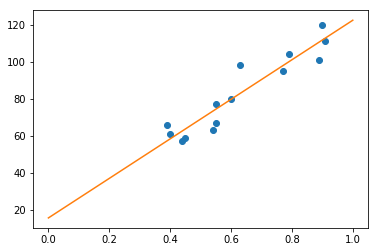
Ok… but how do I do Regression in Python? (using sklearn)
We will use the sklearn library in Python to calculate the Linear Regression for us. It receives the input data (the mean_pupil_dilation vector) and the expected output data (the total_reading_time vector). Then it updates its coef_ and intercept_ variables with the slope and intercept, respectively.
(Importantly, because the problem of Linear Regression is quite simple, it is likely not using Gradient Descent in sklearn)
# Adapted from http://scikit-learn.org/stable/modules/linear_model.html

# from sklearn import linear_model

# LinearRegression() returns an object that we will use to do regression
reg = linear_model.LinearRegression()

# Prepare our data
X = np.expand_dims(mean_pupil_dilation, axis=1)
Y = total_reading_time

# And print it to the screen
print("X: ", X)
print("Y: ", Y)

# Now we use the `reg` object to learn the best line
reg.fit(X, Y)

# And show, as output, the slope and intercept of the learnt line
reg.coef_, reg.intercept_
X:  [[0.9 ]
 [0.89]
 [0.79]
 [0.91]
 [0.77]
 [0.63]
 [0.55]
 [0.6 ]
 [0.55]
 [0.54]
 [0.45]
 [0.44]
 [0.4 ]
 [0.39]]
Y:  [120. 101. 104. 111.  95.  98.  77.  80.  67.  63.  59.  57.  61.  66.]


(array([106.68664055]), 15.649335484366574)
Now we can just plot the line we found using the intercept and slope we found:
# Now we will plot the data
# Define a line using the slope and intercept that we got from the previous snippet
x = np.linspace(0, 1, 100)
y = reg.coef_ * x + reg.intercept_

# Creates the canvas
fig, axes = plt.subplots()

# Plots the dots
axes.plot(mean_pupil_dilation, total_reading_time, 'o')

# Plots the line
axes.plot(x, y)
[<matplotlib.lines.Line2D at 0x7f1513efb898>]
Wrapping Up
Recapitulating, we defined the problem of Regression, defined a (fictitious) dataset on which to base our examples, formulated the problem for one dimension, learned how to evaluate a “solution”, and how this evaluation is used to iteratively find better and better lines (using the Gradient Descent algorithm). Then we expanded the idea for more than one dimension, and finally saw how to do this in Python (actually, we just used a function – which actually probably doesn’t use this method, but, oh, well, the result is what we were looking for).
There is A LOT more to talk about this, but hopefully this was a gentle enough introduction to the topic. In a next post, I intend to cover Logistic Regression. Hopefully, in a third post, I will be able to show how Logistic Regression relates to the artificial neuron.
Very importantly, I think I should mention that this blog post wouldn’t have come
into existence if it were not for Kristina Kolesova and Philipp Blandfort,
who organized the course of Computational Linguistics in the University along with me,
and Shanley Allen, my PhD advisor, who caused us to bring the course into existence.
31 Jan 2018
In
my first blog post on Convolutions
(no need to go read there: this blog post is supposed to be
“self-contained”)
I discusssed a little about how it would be a good idea to reinterpret
the discretized version of the 1D function $f$ as a vector with an
infinite number of dimensions. Basically, the only difference between
the two ways of viewing this “list of numbers” was that the vector
lacked a “reference point”, i.e., the $t$ we had there. Because $f$
was a
very nice type of function that was non-zero only for a certain range
of $t$’s, we found a way to get this reference point back by dropping
the rest of $f$ where $f$ was always zero.
In this blog post, I want to talk about yet another way in which we
can look at a vector (and, consequently, at a function $f$). In the
next few sections, I will recapitulate the ideas presented in
the blog post on Convolutions,
explain the other interpretation of vectors, and show how it may be
useful when training a classifier.
Arrays Can Be Reinterpreted As Discrete Functions
Let’s recapitulate what we learned in the previous blog post. In the
example, I had a signal $f$ that looked like the following:
Because we wanted to avoid calculating an integral (the calculation
of the convolution, which was the problem we wanted to solve,
required the solution of an integral), and because we
were not dramatically concerned with numeric precision, we concluded
it would be a good approximation to just use a discrete version of
this signal. We therefore sampled only certain evenly spaced points
from this function, and we called this process “discretization”:
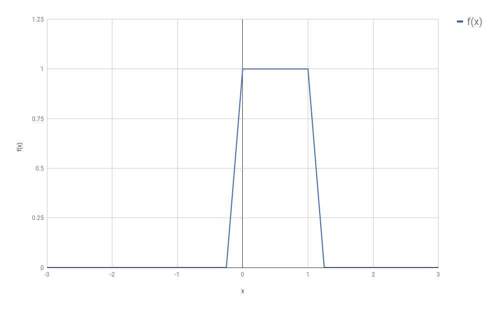
(In our original setting, $f$ was a function that turned out to be
composed by non-zero values only in a small part of its domain. The
rest was only zeros, extending vastly to the right and to the left
of that region. This was convenient for our convolutions, and will
be convenient too for our discussion below, although most of the
ideas presented below are going to still work if we drop this
assumption.)
I would like to introduce some names here, so that I can refer to
things in a more unambiguous way. Let $f_{discretized}$ be the newly
created function, that came into existence after we sampled several
points from $f$, all of which are evenly spaced. Additionally, let
us call $s$ the space between each sample. For the purposes of
this blog post, we will consider we have any arbitrary $s$. It does
not really matter how big or small $s$ is, as long as you (as a
human being) feel that the new discrete function you are defining
resembles well enough (based on your own notion of “enough”) the
original $f$. If you choose an $s$ that is too large, you might
end up missing all non-zero points of $f$ (or taking only
one non-zero point, depending on where you start). If your
$s \to 0$, then you have back the continuous function, and your
discretization had basically no effect.
Your new function $f_{discretized}$ now could be seen as a vector
composed of mostly zeros, except for a small region:
\[f_{discretized} = [\dots 0, 0, 1, 1, 1, 1, 0, 0, \dots]\]
Because this is an infinite array, it is hard to know exactly where
it “starts” (or where it “ends”). In the introduction to this post I
said this was a “problem”, and we had solved it by dropping
the two regions composed exclusively by zeroes:
\[f_{discretized} = [1, 1, 1, 1]\]
Of course, we could have retained some of the zeros, if it was for
any reason convenient to us. It doesn’t matter much. The main idea
here is that we now have a convenient way to represent functions
compactly through vectors. This also means that anything that works
for vectors (dot products, angles, norms) also should have some
interpretation for discrete functions. Think about it!
Disclaiming Interlude
To say the truth, I don’t think that the lack of a “reference point”,
as I said before, is a problem at all. From a
“maths” perspective, we could solve this by adopting literally any
element as our “start”, and from there we can index all other
elements. We could even conveniently choose the element that
corresponds to our $t = 0$, and it is almost as if we had $f$ back.
Mathematicians are quite used to deal with “infinity”, and
these seem quite reasonable ideas.
Other human beings, however, would probably not have the same ease,
and our machines have unfortunately a limited amount of memory. We
would like to keep in our memory only the things we actually care
about… and we don’t care a lot about zeros: they kill any number
they multiply with, and work as an identity after the sum.
Arrays Can Be Reinterpreted As Distributions
It is very likely that, just by reading the heading of this section,
you already got everything you need to know. There is no magic
insight in here: I just intend to go through the ideas slowly and
make it clear why (and, in some ways, how) the heading is true.
If you already got it, I would invite you to skip to the next section,
that tries to show examples when the multiple facets of vectors are
useful. If you stick to me, however, I hope this section may be
beneficial.
What is a Distribution?
When I had a course on Statistics in my Bachelor, it was really bad.
At the time of the exam, it seemed I should be much more concerned
with how to round the decimal numbers after the
comma, than with the
actual concepts I was supposed to have learnt.
As a consequence, I didn’t understand much of statistics when I
started with Machine Learning and it took me a great deal of
self-studying to realize some of the things in this blog post.
One of these things was the meaning of the word distribution. This
is for me a tricky word, and to be fair I might still miss some of its
theoretical details (I just went to Wikipedia, and
the article on the topic
seems so much more complicated than I’d like it to be). For our
purposes here, I will consider a distribution any function that
satisfies the following two criteria:
- It is composed exclusively of positive numbers
- The area below the curve sums up to 1
(For the avid reader: I am avoiding the word “integral”
because I don’t want to bump into “the integral of a point”, that is
tricky and unnecessary here)
There is one more important element to be discussed about
distributions: any distribution is a function of one of more
random variables. These variables represent the thing we are trying
to find the probability of. For example, they might be the height
of the people in a population, the time people take to read a
sentence, or the age of people when they lose their first tooth.
On Discrete Distributions
(I actually spent a lot of time writing about how continuous
distributions could be reinterpreted as vectors, but I have the
feeling it was becoming overcomplicated, so I thought I better
dedicate one new blog post to my views on continuous distributions)
I believe you should think of Discrete Distributions as the
collection of the
probabilities that a given random variable assumes any of the values
it can assume. For example, let’s say that my random variable $X$
represents the current weather, and that it can be one of the
following three possibilities: (1) sunny, (2) cloudy, (3) rainy.
Let’s put these three values in a set $\mathcal{X}$, i.e.,
$\mathcal{X} = \{sunny, cloudy, rainy \}$. Then
a probability distribution would tell me all of $P(sunny)$,
$P(cloudy)$ and $P(rainy)$. Let’s say that we know the values for
these three probabilities:
\[\begin{align*}
P(X = sunny) &= 0.7 \\
P(X = cloudy) &= 0.2 \\
P(X = rainy) &= 0.1 \\
\end{align*}\]
In that case, it should be easy to conclude that we could represent
this probability distribution with the vector $[0.7, 0.2, 0.1]$.
Yes! It is this simple! Each one of the outcomes becomes one of the
elements of the vector. The ordering is arbitrary. We could have just
as well chosen to create a vector $[0.2, 0.7, 0.1]$ from those three
values.
But What If My Vector Does Not Sum Up To 1
It may be too easy to transform a distribution into a vector; but
what if I have a vector and would like to transform it into a
probability distribution? For example, let’s say that I have some
computer program that receives all sorts of data (such as the
humidity of the air in several sensors, the temperature, the speed
of the wind, etc.) and just outputs scores for how sunny, cloudy or
rainy it may be. Imagine that one possible vector of scores is
$[101, 379, 44]$. Let’s call it $A$. To facilitate the notation, I
would like to be able to call the three elements of $A$ by the value
of $X$ they represent. So $A_{sunny} = 101$, $A_{cloudy} = 379$, and
$A_{rainy} = 44$.
If I wanted to transform $A$ into a distribution, then how should I
proceed?
There are actually two common ways of doing this. I’ll start by the
naïve way, which is not very common, but could be useful if your
values are really almost summing up to 1. (Really… they just need
some rounding, and you’d like to make this rounding.) In this case,
do it the easy way: just divide each number by the sum of all values
in $A$:
\[P(X = x) = \frac{A_x}{\sum_{i \in \mathcal{X}}{~A_i}}\]
This solution would actually work well for our scores. Let’s see how
it works in practice:
\[\begin{align*}
P(X = sunny) &= \frac{101}{101 + 379 + 44} = 0.19 \\ \\
P(X = cloudy) &= \frac{379}{101 + 379 + 44} = 0.72 \\ \\
P(X = rainy) &= \frac{44} {101 + 379 + 44} = 0.08 \\ \\
P(X) &= [0.19, 0.72, 0.08]
\end{align*}\]
While this might seem like an intuitive way of doing things, this is
normally not the way people transform vectors into probabilities.
Why? Notice that this worked well because all our scores were
positive. Take a look at what would have happened if our scores were
$B = [10, -9, -1]$:
\[\begin{align*}
P(X = sunny) &= \frac{10}{10 - 9 - 1} = \frac{10}{0} \\ \\
P(X = cloudy) &= \frac{-9}{10 - 9 - 1} = \frac{-9}{0} \\ \\
P(X = rainy) &= \frac{-1}{10 - 9 - 1} = \frac{-1}{0} \\ \\
\end{align*}\]
(Ahem)
You could argue that I should, then, instead, just take the absolute
values of the scores. This would still not work: the probability
$P(X=cloudy)$ would be almost the same as $P(X=sunny)$,
even though $-9$ seems much “worse” than $10$ (or even worse than
$-1$). Take a look:
\[\begin{align*}
P(X = sunny) &= \frac{10}{10 + 9 + 1} = \frac{10}{20} \\ \\
P(X = cloudy) &= \frac{ 9}{10 + 9 + 1} = \frac{9}{20} \\ \\
P(X = rainy) &= \frac{ 1}{10 + 9 + 1} = \frac{1}{20} \\ \\
\end{align*}\]
So what is the right way? To make things always work, we want to only
have positive values in our fractions. What kind of function receives
any real number and transforms it into some positive number? You bet
well: the exponential! So what we want to do is to pass each
element of $B$ (or $A$) through an exponential function. To make things
concrete:
\[\begin{align*}
P(X = sunny) &= \frac{e^{10}}{e^{10} + e^{-9} + e^{-1}} = \frac{22026.46}{22026.83} = 0.99998 \\ \\
P(X = cloudy) &= \frac{e^{-9}}{e^{10} + e^{-9} + e^{-1}} = \frac{0.0001234}{22026.83} = 0.0000000056 \\ \\
P(X = rainy) &= \frac{e^{-1}}{e^{10} + e^{-9} + e^{-1}} = \frac{0.3679}{22026.83} = 0.0000167 \\ \\
\end{align*}\]
The exponential function does amplify a lot the discrepancy between
the values (now $sunny$ has probability almost 1), but it is the
common way of transforming real numbers into a probability
distribution:
\[P(X = x) = \frac{\exp({A_x})}{\sum_{i \in \mathcal{X}}{~\exp({A_i})}}\]
This formula goes by the name of softmax and you should totally get
super used to it: it appears everywhere in Machine Learning!
Ok… but… so what? How is this even useful?
More or less at the same time I was writing this blog post, I was
preparing some class related to Deep Learning that I was
supposed to present at the University of Fribourg (in November/2017). I thought
it would be a good idea to introduce the exact same discussion above to the
people there. When I reached this part of the lecture, it became actually quite
hard to find good reasons why knowing all of the above was useful.
One reason, however, came to my mind, that I liked. If you
know that the vector you have is a distribution (i.e., if you
are able to interpret it this way), then all of the results you know from
Information Theory should automatically apply. Most importantly, the discussion
above should be able to justify why you would like to use the Cross-Entropy as a
loss function to train your neural network. To make things clearer, let’s say
that you were given many images of digits written by hand (like those I referred
to in my previous blog post):
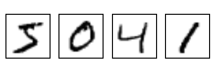
Now let’s say that you wanted to train a neural network that, given any of these
images, would output the “class” that it belongs to. For example, in the image
above, the first image is of the “class” 5, the second image is of the the
class 0, and so on. If you are used to
backpropagation
then you would (probably thoughtlessly) write your code using something like
the categorical_crossentropy of
tflearn (or anything
equivalent). This function receives the output of the network (the values
“predicted” by the network) and the expected output. This expected output is
normally a one-hot encoded vector,
i.e., a vector with zeros in all positions, except for the position
corresponding to the class of the input, where it should have a 1. In our
example, if the first position corresponds to the class 0, then every time we
gave a picture of a 0 to the network we would also use, in the call to our loss
function, a one-hot encoded vector with a 1 in the first position. If the second
position corresponded to the class 1, then every time we gave a picture of a 1
to the network we would also give a one-hot encoded vector with a 1 in the
second position to our loss function.
If you look at these two vectors, you will realize that both of them can be
interpreted as probability distributions: the “predicted” vector (the vector
output by the network) is the output of a softmax layer; and the “one-hot”
encoded vector always sums up to 1 (because it has zeros in all positions
except one of them). Since both of them are distributions, then we can
calculate the cross-entropy $H(expected, predicted)$ as
\[H(expected, predicted) = - \sum_i{expected_i \log(predicted_i)}\]
and this value will be large when the predicted values are very different from
the expected ones, which sounds like exactly what we would like to have as a
loss function.
Conclusion
Everything discussed in this blog post was extremely basic. I would have been
very thankful, however, if anyone had told me these things before. I hope this
will be helpful to people who are starting with Machine Learning.
09 Sep 2017
This blog post is the result of a conversation I had with some
friends some time ago. The discussion started when an idea was raised:
that the hidden layers of a Neural Network should be called its
“memory”. To say the truth, one could think that way, if he wants to
think that the network is storing in a “memory” what it has learnt.
Still, the way people tend to take it is that these are “latent
variables” that the network learnt to extract from the noisy signal
that is given to it as input.
This raised the topic of Representation Learning, which I thought I’d
discuss a little here. I would like to focus on the task of
classification, where a given input must be
assigned a certain label $y$. Let’s even simplify things and say that
we have a binary classification task, where the label $y$ can be
either $0$ or $1$.
I’d like to think that I have a dataset
$\textbf{x} = {x_1, x_2, x_3, … }$ composed by many inputs $x_i$,
where each $x_i$ could be some vector.
Let’s imagine what happens when we start
stacking several layers after one another. Even better, let’s see
it:
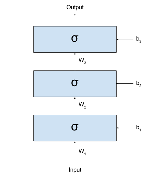
If we call the output of the network $y_{prediction}$,
we could represent the same network with the following formula:
\[y_{prediction} = \sigma(W_3 \times \sigma(W_2 \times \sigma(W_1 \times x + b_1) + b_2) + b_3)\]
(I like a lot to look at these formulas. They demystify a lot all the
complexity that Neural Networks seem to be built upon.)
As you can see (and as very well discussed in
this great Christopher Olah’s blog post),
what these networks are doing is basically
- Linearly transforming the input space into some other space (this is done
by the multiplication by $W_k$ and sum by $b_y$);
- Non-linearly transforming the input space through the application
of the sigmoid function.
Each time these two steps are applied, the input values are more
distinctly separated into two groups: those where $y = 0$, and
those where $y = 1$. There is, for most $x_i$ in class $y=0$ and
$x_j$ is in class $y=1$, the values in
$\sigma(W_1 \times x_i + b_1)$ and
$\sigma(W_1 \times x_j + b_1)$ will probably be better separable
than the raw $x_i$s and $x_j$s. (here, I am using the expression “better
separable” very loosely. I hope you get the idea: the values
will not necessarily be “farther” from each other, but it will
probably be easier to trace a line dividing all elements of the
two classes.)
This way, if I treat the inputs as signals, then
the input to the next layer could be thought as a cleaned version of
the signal of the previous layer. By cleaned version I mean
that the output of the previous (lower) layer are
“latent variables” extracted from the (potentially) noisy signal
used as input.
To make things clearer, I would like to present an example. Imagine
I gave you lots of black and white images with
digits written by hand: (these are MNIST images. I am linking to an
image from Tensorflow. I hope it won’t change the link so soon =) )
(to keep the binary classification task, let’s say
I want to divide them into “smaller than 5” and “not smaller than 5”.)
The first hidden layer would then receive the raw images, and somehow
process them into some (very abstract, hard to understand)
activations. If you think well,
I could take the entire dataset, pass through the first layer,
and generate a new dataset that is the result of applying the
first layer to all your images:
\[x_i^{transformed} = \sigma(W_1 \times x_i + b_1), ~~~~~ \forall x_i \in \textbf{x}\]
After transforming my dataset, I could simply cut the first layer
of my network:
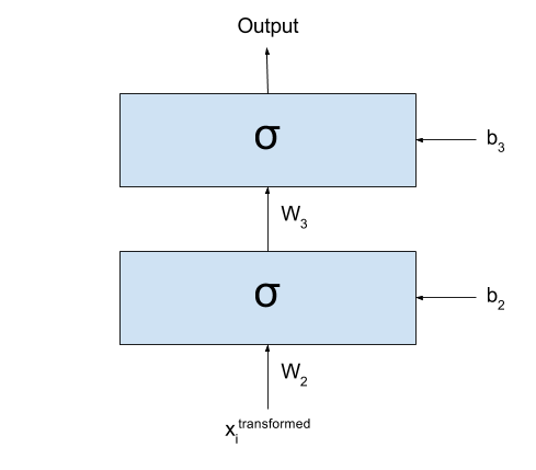
Basically what I have now is exactly the same as I had before: all
my input data $\textbf{x}$ was transformed into a new dataset
$\textbf{x}^{transformed}$ by going through the first layer of my network.
I could even forget that my dataset one day were those images
and imagine that the dataset for my classification task is actually
$\textbf{x}^{transformed}$.
Well, since we are here, what prevents me from repeating this
procedure again and again? As we keep doing this multiple times,
we would see that the new datasets that we are generating divide
the space better and better for our classification problem.
Now, there are many ways in which I can say this, so I’ll say it in
all ways I can think of:
- Each new dataset is composed by “latent variables” extracted from
the preceding dataset.
- Each new dataset is composed by “features” extracted from the
preceding dataset.
- Each new dataset is a new “representation” extracted from the
preceding dataset.
Work on learning new representations from the data is interesting
because very often some representations extracted from the raw data
when performing a certain task may be useful for performing several
other tasks. For example, features extracted for doing image
classification may be “reused” for, say, Visual Question
Answering (where a model has to answer question about an image).
This is a vivid area of research, with conferences every year whose
sole purpose is discussing the learning of representations!
However
There is a catch on what I said.
I spent the post saying that, at each step, the layers would separate
the data space better and better for the task we are performing.
If that is the case, then any network with A LOT of layers would
perform very well, right?
But it turns out that only in ~2006 people started managing to train
several layers effectively (up to then, many believed that more
layers only disturbed the training, instead of helping). Why? The
problem is that these same weights that may help in separating the
space into a better representation, if badly trained, may end up
transforming the input into complete nonsense.
Let’s assume that some of our $W_k$ is so badly trained that, for
any given input, it returns something that is completely (REALLY)
random (I actually have to stop and think about how possible this
might be, but for the sake of the example let’s assume that it is).
When out input data crosses that one transformation, it loses all
the structure it had. It loses any information, any recoverable piece
of actual “usefulness”. From then on, any structure found in the
following layers will not reflect the structures found in the input,
and we are left hopeless.
In fact, we don’t actually even need complete randomness to lose
information..
If the “entropy” of the next representation is so high that too many
“structures” that were present in the previous layer are transformed
into noise, then recovering the information in the subsequent layers
may be very hard (sometimes even impossible).
To illustrate how we can lose just some small structures of our data,
I will use an example that is related to the meaning of my life:
languages. Let’s imagine that there is some dialect of
English that makes no difference between two sounds: h and r. So
people living in this place say things like This is an a-hey of
integers? or I went rome. (incidentally, this is actually not a huge
stretch: Brazilians wouldn’t say the second one, but often say
the first one. We sometimes really don’t make any difference between
the two sounds. But well… we only learn English later, right?)
Now imagine what would happen if a
person from this place spoke with another person from, say, the UK.
The person from the UK can, most of the times, identify which words
are being spoken based on other patterns in the data (for example,
he knows that a-hey means array in the sentence above, because he
can’t think of any word like a-hey that can go in that context).
But what happens if he is talking about a product and
the strange-dialect (say, Brazilian) person says:
(1) I hated it as soon as I bought it
Or even, without any context, something like
(2) I saw a hat in the ground
It is simply impossible to distinguish now which of the alternatives
is the correct one: both options are right! This is what I mean
when I say it is sometimes impossible to recover the information
corrupted by some noise.
So what am I trying to say with all this discussion? My point here
is that it is not just the introduction of several layers that brings
better results, but also the usage of better algorithms for training
those layers. This is what changed in ~2006, when
some very notable researchers found a good algorithm for initializing each $W_k$ and $b_k$.
(This algorithm became eventually known as
Greedy Layer-Wise (Pre)Training,
although some simply called it by the non-fancified name of
“Unsupervised Pretraining”).
It had finally become clear the problem were not multiple layers; the
problem was elsewhere!
Conclusion
We went through some Representation Learning, and then discussed
the importance of the training process in our networks. Somewhere
along with this last discussion, we got an
intuition on how noise can corrupt information.
The ideas we went through here are very powerful. They are what
drives my interest in Deep Learning. I hope you can find them as
interesting as I do =)
I would like to thank three friends for having given me the ideas
for this post (in alphabetic order to be fair):
- Ayushman Dash: who suggested
me to write it.
- Bhupen Chauhan: he started the
wondering about the ideas of memory and representation.
- Sidharth Sahu (I’ll add a link for him here soon): a lot of the
discussion here are my thoughts about his wonderings during the
conversation.
28 Aug 2017
In my last blog post,
I took you by the hand and guided you through
the realm of convolutions. I hope to have made it clear why it makes
sense to discretize functions and represent them as vector, and how
to calculate the convolution of 1D and 2D vectors.
In this post I want to talk a little about how Image Processing was
done in the old times, and show the relation between the procedures
performed back then and the kinds of parameters learnt by
Convolutional Neural Networks (CNN). In fact, do notice that CNNs
have been lurking around for years
(LeNet
had been introduced in 1998!) before they went viral again in
2012 (with the AlexNet), so, in a way, they are concurrent models to
the models described below.
It is hard to tell why Convolutional Neural Networks took so long to
become popular. One reason might be that Neural Networks
had gone somewhat out of fashion for a while until their revival
some years ago.
(Hugo Larochelle
commented in this TEDx video how there were papers that were rejected
simply based on the argument that his approach used Neural Networks.)
Another contributing factor might be that, for a long time, it was a
common belief for many people that Neural Networks with many layers
were not good (despite the work with
LSTMs being
done in Europe). They were taken as “hard to train” and empirically
many experiments ended up producing better performances for models
with just a few (or even only one) layer. CNNs, however, did not
suffer from these problems (at least not that much), and the LeNet
paper from 1998 had already 5 layers.
But my focus here is not on the architecture of CNNs, nor on their
gradient flow or their history. My focus here is on how exactly we
can say that the shared weights of a CNN results in a mathematical
formulation that is identical to that of the Convolutions that we
discussed in the previous post.
Image Processing
Before I go into the CNNs I want to show why a Convolutional is
something that we might want to do to an image. In my previous post,
I tried to be as generic as possible, talking about functions and
vectors, speaking from a “signal processing” point of
view. It turns out that the Image Processing community has its own
perspective. So, from now on, I will take $f$ as a 2D image that I
want to somehow process, and to $g$ as a
kernel.
When we learn math in school, we learn names of several functions that
are known to be useful, and somehow represent well parts of the world
we live in. Examples of such functions are $log$, $ln$, $sin$, or
$tg$.
When we are introduced to statistics, we get acquainted to several
other names, such as “correlation”, “standard deviation”, “variance”,
“mean” or “mode”. The types of kernels used in Image Processing are
not different: researchers in the area have found through the years
several kernels that are known to perform well different kinds of
tasks, such as blurring, edge detection, sharpening, etc.
You can find a list of such kernels in the
Wikipedia article.
I want to show how a convolution could be used to find the edges
of an image. But this time, I don’t want to show formulas; I think
some Python code should make things clearer. Let’s say we want to
find the borders of the following image of
Lenna:
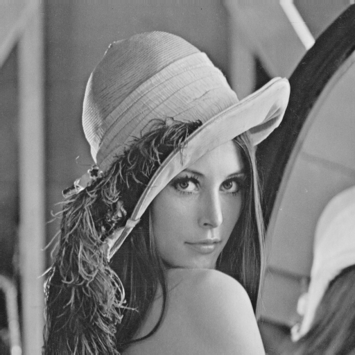
The first thing to do is to load the image:
from PIL import Image
img = Image.open('lenna.bmp')
Then I want to create a function to convolve the image
with the kernel:
# import numpy as np

def convolve(image, kernel):
	# Flips the kernel both left-to-right and up-to-down
	kernel = np.fliplr(np.flipud(kernel))

	# Transforms the image into something that numpy can process
	image_array = np.array(image)

	# Initializes the image I want to return
	new_image_array = np.zeros(image_array.shape)

	# Convolve
	for i in range(image_array.shape[0] - kernel.shape[0]):
		for j in range(image_array.shape[1] - kernel.shape[1]):
			# run_kernel will perform the pointwise multiplication
			# followed by sum
			new_image_array[i][j] = run_kernel(image_array, kernel, i, j)

	# Creates a new Image object
	new_image = Image.fromarray(new_image_array)

	# Returns both the image as an array, and as an Image object
	return new_image_array, new_image
As you can see, I am using numpy to perform the calculations. I
expect you not to find it hard to understand the code. It could
obviously be written much more efficiently (numpy actually even
has a function that performs the convolution anyway), but I wanted
to show how the operations we saw in the last blog post can be easily
translated into some piece of code.
Now we need to define that run_kernel() function. It calculates the
$\odot$ operation between the part of the image that we are interested
in and the (already flipped) kernel. This is as simple as:
def run_kernel(image, kernel, pos_x, pos_y):
	ret = 0
	for i in range(kernel.shape[0]):
		for j in range(kernel.shape[1]):
			ret += image[pos_x + i][pos_y + j] * kernel[i][j]

	return ret
Done! It is that simple!
What we are missing is just the right kernel. If you look at the
Wikipedia page you’ll see that there are several kernels usable for
Edge detection. I’ll use the third one:
\[kernel =
\begin{bmatrix}
-1 & -1 & -1 \\
-1 & 8 & -1 \\
-1 & -1 & -1
\end{bmatrix}\]
In Python:
new_image_array, new_image = convolve(img, np.array([[-1,-1,-1],[-1,8,-1],[-1,-1,-1]]))
new_image.show()
With this, you should see the following image:
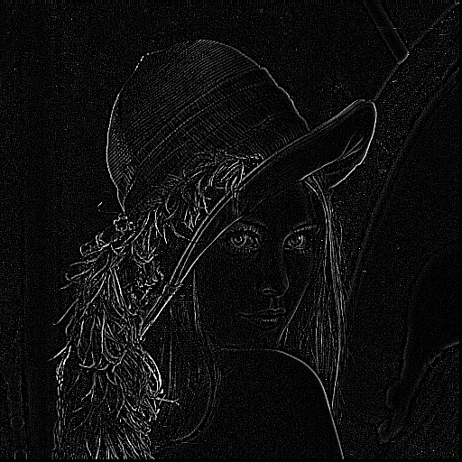
Nice, right?
The Border Problem
If you look carefully at this new image, you’ll see that I’m not
running run_kernel() in the last pixels (and then you’ll find some
columns of zero pixels at the right of the image, as well as some
some rows at the bottom). This has to do with what I called the “Border
Problem” in my last post.
It is actually very unclear what should be done in the edges of the
Image we are trying to process. The way I have been doing so far, if I
calculate a convolution between two $3 \times 3$ matrices, it will
give me only one number. If you think well about what the size of the
final output would be, you will see that it depends on the kernel size.
Let’s assume that our final image has $n$ pixels both horizontally and
vertically.
For a kernel of size $1 \times 1$ (i.e., just a number), the size of
the final image would be the same as the size of the original image
If the kernel were $2 \times 2$, then the output would have size
$n-1 \times n-1$. For a $3 \times 3$ kernel, it would be
$n-2 \times n-2$. You can see how this generalizes to
$n-(k+1) \times n-(k+1)$, where $k$ is the size of the kernel.
It would be nice if I could find ways to get
a result that had the same size of the input image. The most obvious
way to do this is to assume that there are zeros beyond the borders
of the images. If you think that the images are signals just like
the signals from my previous blog post, you should feel that this is
a very reasonable assumption to make. Using this assumptions,
you will see three types of convolutions:
-
Valid: This is the way I have been doing it so far. We don’t
assume any information apart from what we have.
-
Full: This is the case where we assume there are lots of zeros
beyond that the edge of the original image. This way, if we
were given the image $f$ below, then it would be
“transformed” into the $f_{transformed}$ below before
convolving. The number of new rows/columns introduced depends
on the size of the kernel. As I said, this should make sense
from the perspective of signal processing I described in my
previous post.
(if this is not clear enough, you are welcome to take a look at
this amazing explanation I found in Stack Overflow)
\[f =
\begin{bmatrix}
0 & 3 & 6 & 3 \\
3 & 6 & 3 & 6 \\
6 & 3 & 6 & 3 \\
3 & 6 & 3 & 0 \\
\end{bmatrix}\]
\[f_{transformed} =
\begin{bmatrix}
0 & 0 & 0 & 0 & 0 & 0 & 0 & 0 \\
0 & 0 & 0 & 0 & 0 & 0 & 0 & 0 \\
0 & 0 & 0 & 3 & 6 & 3 & 0 & 0 \\
0 & 0 & 3 & 6 & 3 & 6 & 0 & 0 \\
0 & 0 & 6 & 3 & 6 & 3 & 0 & 0 \\
0 & 0 & 3 & 6 & 3 & 0 & 0 & 0 \\
0 & 0 & 0 & 0 & 0 & 0 & 0 & 0 \\
0 & 0 & 0 & 0 & 0 & 0 & 0 & 0 \\
\end{bmatrix}\]
- Same: This is a little trickier. It also assume zeros around
the image, but only as much as needed to return an output that
has the exact same size as the input image. I tend to find it
hard to visualize, but I found that
this image
helped a lot.
Relation to Convolutional Neural Networks
Ok… so I think we covered everything there was to cover about
Convolutions. Now I just need to answer: how do they relate to CNNs?
Remember how the convolutions are being calculated: for a given point
in “time”, we multiply the values of both matrices pointwise and then
sum them all.
Now… remember how the connections of the Convolutional Layer are
organized:
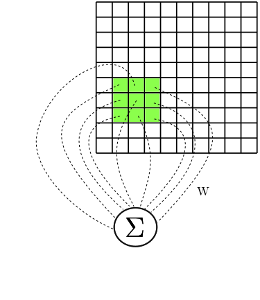
Let’s look at one neuron individually. I’d like to call it $a$.
It has access to a certain
rectangular part of the image. Let’s represent the values of this
rectangular part by $A$. So, for example, $A_{0,0}$ represents the
element in the leftmost and topmost corner of that rectangular part
of the image that our neuron $a$ has access to.
Now, let’s say that $W$ is a matrix with the weights corresponding
to the connections between $a$ and the values in $A$. Then
the input to $a$ is calculated as
\[\sum_{1 \le i,j \le k}{W_{i,j} \times A_{i,j}}\]
Doesn’t this look a lot like the $\odot$ operation from our kernels?
It looks a lot like I am running run_kernel() giving as input the
subimage $A$ and the kernel $W$.
Now, let’s focus on another neuron, $b$, and again use a new matrix
$B$ to represent the rectangular part of the image that our second
neuron has access to. (I hope you see where this is going.)
Again, let $V$ denote a matrix composed of the weights of the
connections between $b$ and $B$. Then, again, the input to $b$ is
calculated as
\[\sum_{1 \le i,j \le k}{V_{i,j} \times B_{i,j}}\]
Again, it looks a lot like I just calculated $B \odot V$, doesn’t it?
If this is hard to see with the formulas, the following image should
help a little. It shows the subimages $A$ and $B$, and the connections
$W$ and $V$, and how the values are summed when given as input to our
neurons $a$ and $b$:
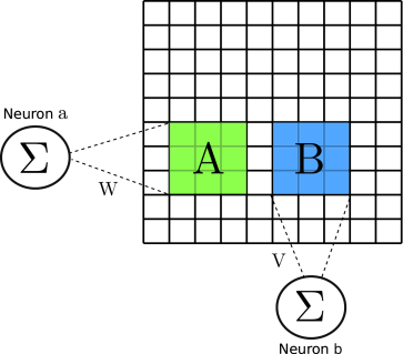
Ok, so now you know that the Convolutional layer is running our
$\odot$ operation on small subparts of the image.
There is just one last point to be made: Convolutional Neural Networks
use shared weights. This means the $W = V$! And this also means that
the kernel $W$ (or $V$) is always the same for whichever neuron you
choose. This means that if I chose at random any new neuron $c$ to
inspect (and defined $C$ as the matrix corresponding to the rectangular
part of the input image that $c$ has access to), then the calculation
that I would perform would still be
\[\begin{split}
\sum_{1 \le i,j \le k}{W_{i,j} \times C_{i,j}} &=
\sum_{1 \le i,j \le k}{V_{i,j} \times C_{i,j}}
\end{split}\]
(because, as I said $W = V$!)
In summary, this means that the operation these layers are performing
is identical to a Convolution!
Why do we want CNNs?
Now you could ask me: ok, the Image Processing community knows all
of these kernels that do magic with my images. Why would I care to
have a complex architecture that ends up doing exactly the same
kind of thing?
The answer I am going to give is simple, but has huge implications.
So far, the Image Processing community had to use their knowledge
about how real images generally look like and burn a lot of their
own neurons (I mean, figuratively) to generate kernels that somehow
fit the problems they were trying to solve. So, if they wanted to
find characteristics in the images that would help them to solve the
problem they were trying to solve, they had to manually invent
kernels that they deemed useful for their task. Many of these kernels
followed some patterns/constraints of, e.g., summing up to 1, so
that the values of the output image wouldn’t saturate. These patterns
somehow limited the types kernels that one could invent, and it was
very unintuitive to create anything following different patterns.
But what if, instead of creating kernels by hand (and being bound
by constraints, and by our intuition) we could just give a lot of
data to a statistical model and just hope that it learns something
useful in the end? This is exactly what Convolutional Neural
Networks are for. The kernels that are learnt by the CNN are
generally not very intuitive, and probably no human would have
easily guessed that they are useful for the tasks that these networks
are trying to solve (be it classification, of segmentation, or
whatever). Still, they have shown great results, and (I would
go so far as to say that) the times of “handcrafted feature
engineering” are probably over.
Bonus: Shifting a Signal
Before concluding this blog post, I want to show how convolutions
can be unexpectedly useful to perform some seemingly unrelated task:
the shifting of a signal. I learnt this in the
Neural Turing Machines paper
and found it a very elegant way of solving the problem. In this
section, I’ll go back to my old notation and refer to the 1D signal
$f$. Let’s say it is a discrete signals represented by the
following vector:
\[f = [0,0,0,3,4,5,4,3,0,0]\]
Now let’s say I want to shift all elements of $f$ to the right. How
would I do? One way to do it could be to make a “same” convolution
of $f$ with a function $g = [1,0,0]$. Let’s see how this would work.
\[\begin{split}
(f \ast g)(t = 0) &= (0 \times 1) + (0 \times 0) + (0 \times 0) = 0 \\
(f \ast g)(t = 1) &= (0 \times 1) + (0 \times 0) + (0 \times 0) = 0 \\
(f \ast g)(t = 2) &= (0 \times 1) + (0 \times 0) + (3 \times 0) = 0 \\
(f \ast g)(t = 3) &= (0 \times 1) + (3 \times 0) + (4 \times 0) = 0 \\
(f \ast g)(t = 4) &= (3 \times 1) + (4 \times 0) + (5 \times 0) = 3 \\
(f \ast g)(t = 5) &= (4 \times 1) + (5 \times 0) + (4 \times 0) = 4 \\
(f \ast g)(t = 6) &= (5 \times 1) + (4 \times 0) + (3 \times 0) = 5 \\
(f \ast g)(t = 7) &= (4 \times 1) + (3 \times 0) + (0 \times 0) = 4 \\
(f \ast g)(t = 8) &= (3 \times 1) + (0 \times 0) + (0 \times 0) = 3 \\
(f \ast g)(t = 9) &= (0 \times 1) + (0 \times 0) + (0 \times 0) = 0 \\
(f \ast g) &= [0,0,0,0,3,4,5,4,3,0]
\end{split}\]
(here, I am taking $t=0$ is when the first element of $f$ is aligned
with the element in the center of $g$)
And what if I wanted to shift it to the left? Just use a different
function $g = [0, 0, 1]$:
\[\begin{split}
(f \ast g)(t = 0) &= (0 \times 0) + (0 \times 0) + (0 \times 1) = 0 \\
(f \ast g)(t = 1) &= (0 \times 0) + (0 \times 0) + (0 \times 1) = 0 \\
(f \ast g)(t = 2) &= (0 \times 0) + (0 \times 0) + (3 \times 1) = 3 \\
(f \ast g)(t = 3) &= (0 \times 0) + (3 \times 0) + (4 \times 1) = 4 \\
(f \ast g)(t = 4) &= (3 \times 0) + (4 \times 0) + (5 \times 1) = 5 \\
(f \ast g)(t = 5) &= (4 \times 0) + (5 \times 0) + (4 \times 1) = 4 \\
(f \ast g)(t = 6) &= (5 \times 0) + (4 \times 0) + (3 \times 1) = 3 \\
(f \ast g)(t = 7) &= (4 \times 0) + (3 \times 0) + (0 \times 1) = 0 \\
(f \ast g)(t = 8) &= (3 \times 0) + (0 \times 0) + (0 \times 1) = 0 \\
(f \ast g)(t = 9) &= (0 \times 0) + (0 \times 0) + (0 \times 1) = 0 \\
(f \ast g) &= [0,0,3,4,5,4,3,0,0,0]
\end{split}\]
This example should also give an intuition of how convolutions are a
good way of processing signals. In the case of the Neural Turing
Machines, instead of shifting the signals so “binarily” to the right
or to the left, they allow continuous values to the positions of $g$.
For example, $g$ could be anything like $[0.8, 0.1, 0.1]$. In that
case, most of the signal would be shifted, but part of the
information would remain “spread” (“blurred”) through other positions
of the signal. While this may be unintuitive, we have seen how
unintuitive things may actually be useful for solving some tasks.
Conclusion
I hope to have given a good notion of how CNNs relate to the
convolutions we saw in the previous post. My hope is that this will
provide a good intuition for how convolutions can be used for other
Machine Learning architectures, and allow you to think of convolutions
as just some other tool that you can use to solve your problems.
As you can see, all of this is very simple, but I wish someone had
shown me these ideas when I started learning, instead of having to
learn them all by myself. I hope this post makes it easy to extend
architectures based on convolutions in a way that is sensible
taking into account everything discussed here.