On Inequality and the Coronavirus
26 Apr 2020(throughout this post, I refer to Brasil with “s”. This is one of my political quirks. I do know most people do not prefer this orthography)
It is time of Coronavirus. The world has been put to a halt because of an invisible enemy. The world as we know it has changed, and will likely not be back for a while. Countries have closed their borders, people are confining themselves at their homes, bracing for the hard times to come. In my self-confinement, I was struck by an observation. One that has been more or less made by many, but not with any data to back it up. In this blog post, I’ll try to make it more evident, using some data I realized I had relatively easy access to.
When I started writing this blog post, the Coronavirus had just started getting to Africa, and people had been wondering why the virus seemed to just not have gotten there. Many have suggested that it was the warm weather. After all, as I heard some people suggest, “in the majority of the continent it’s still summer” (of course, this is not true: the vast majority of Africa is in the northern hemisphere, with seasons “in sync” with the rest of Europe, despite the obvious warmer weather). I was not very convinced: why had it gotten already to Brasil, then, where it was actually still wintery? Or, even better, why did it get so bad in Ecuador, a country literally named after a line that implies it is really hot? (By the way, as of the time of this writing, Ecuador is the most dramatic case in South America at the moment).
One important difference between the Coronavirus and many diseases humanity has seen before is that it likes to attack the rich first. (Maybe not the “rich”, but at least the “better off”.) It likes those with “the resources”, who can pay for food in nice restaurants, and cafés, and bars, who go to the cinema, and like their overpriced coffees or frappuccinos and what-not in their fancy Starbucks, speaking different languages, traveling, going to shows, sports events, music festivals. The good side of it is: they can self-quarantine. The bad side is: there is a whole lot of people who can’t.
So when I started writing this blog post, I had another explanation for why the Coronavirus didn’t like to travel to Africa. I had long been looking at the development of the virus across the states of Brasil, and found it interesting how the virus was very fast at arriving in São Paulo or Rio de Janeiro, but took quite long to get to less developed states like Tocantins. I was using this website, made by the people in the Universidade Federal do Rio Grande do Sul (UFRGS, my University), to track the developments of the virus, and, since the data they use is in a quite nice format, I thought I could try using it to answer some of my questions.
The first thing I did was to take the data for each state, get the first day when the Coronavirus arrived at that state, and compare it with its Human Development Index. Using Human Development Index as a proxy for “richness”1, I thought it would be nice to see if it was really true that “development” would be somehow predictive of the movement of the virus.
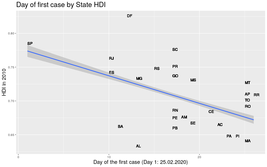
Some people have spoken about how inequality could be a problem in the fight against the Coronavirus. People in lower financial status have higher risk of all sorts of health conditions (heart disease, diabetes, Alzheimer, …), and therefore are more likely to be in risk groups. I went to Google Scholar in search of any academic work about the effects of inequality on the fight against Corona, but literally only found this and this, both of which are just opinion/comment papers looking at inequality as a source of other health conditions, but not at all as a predictor of the movement of the virus around the world2. Well… at least in Brasil, in the state level, there seems to be a correlation between the two factors.
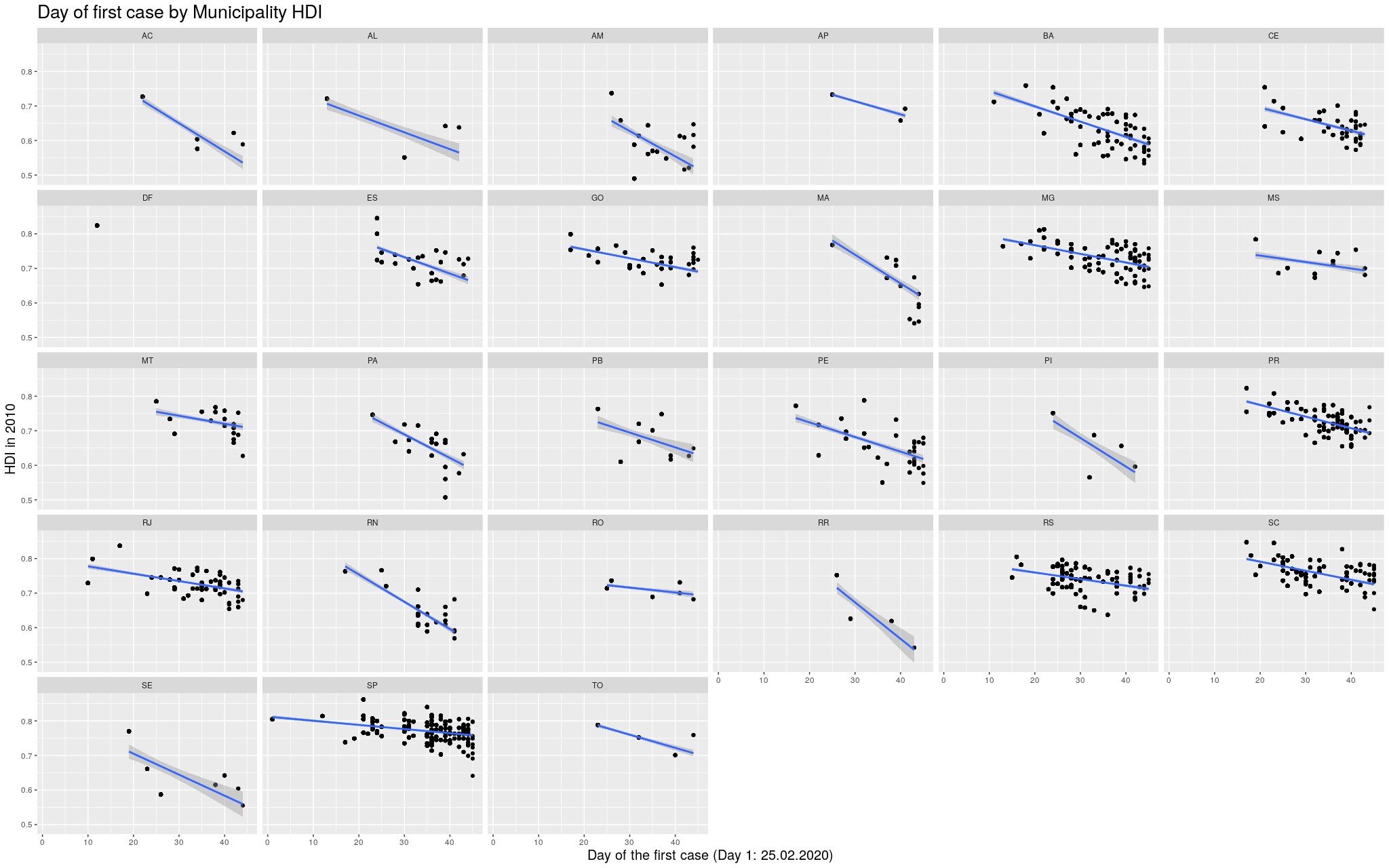
But both the HDI and the Coronavirus data that I was looking at had not only information on the state level, but also on the municipality level. Now… some disclaimers need to be done when interpreting these data. Except for the richer states, most of the airports in Brasil are in state capitals, so it is obvious that the metropolitan area of the state capitals are very likely where the Coronavirus would first appear, independent of their HDI. Also, Brasil has not been testing a lot, for a lot of reasons that are just too complicated to explain here (in a nutshell: presidential incompetence, lack of money, competition for tests against richer countries, diplomatic nuisances, fights inside the government, …). To make sure I didn’t get somewhat “polluted” data, these data are from April 10th, because there were news from April 11th saying that the government would start testing more, but only in a few states, and I was afraid this would deform the data in unexpected ways. (Still, since I’m only looking at the date of “arrival” of the virus in the different places, even that wouldn’t be a problem.)
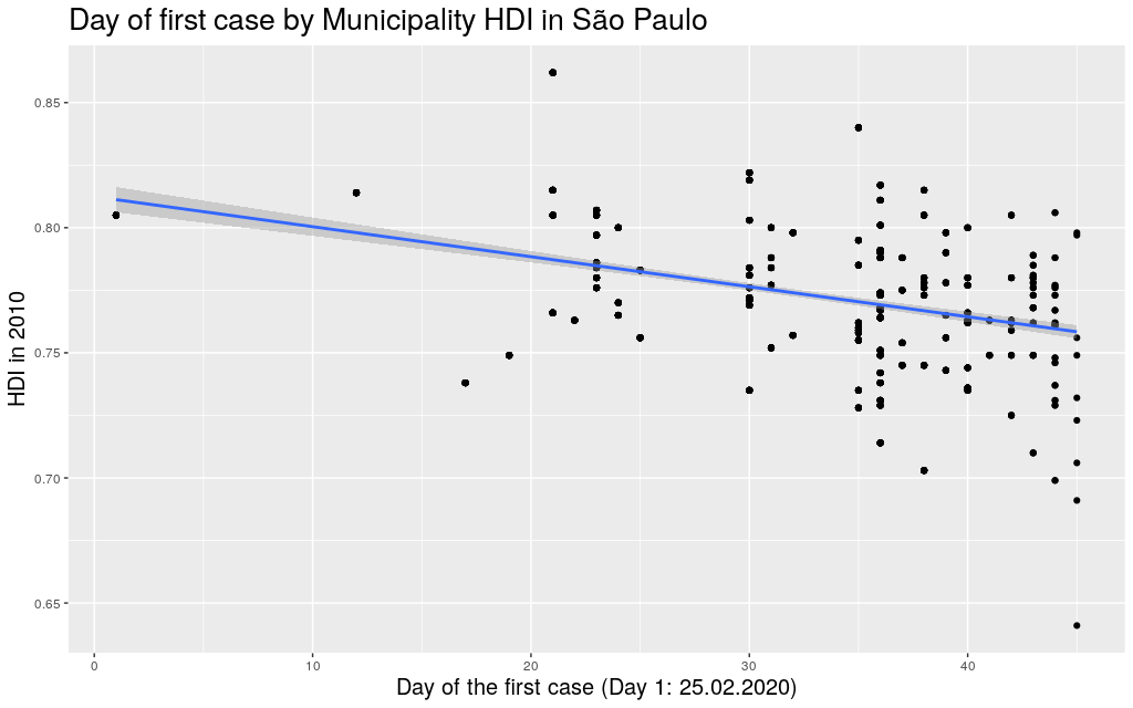
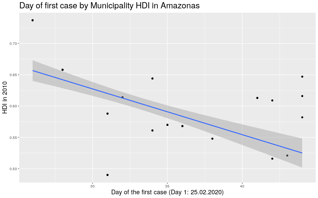
Finally, the sizes of the states and the number of municipalities in them vary widely. For example, take São Paulo, the most populous state. It a state that is “average” in size, has an area of 248Mkm² (roughly the size of the UK) and has 645 municipalities. Then compare São Paulo with Amazonas, the biggest state, with an area of 1559Mkm² (roughly the size of Mongolia). The entirety of that area is divided in only 62 municipalities! This means that the virus needs to travel much less to go beyond the borders of a municipality in São Paulo than in Amazonas, and there are way more people for the virus to infect in these smaller municipalities in São Paulo than Amazonas. The variance is huge!
Ok. With these disclaimers in mind, let’s take a look at some of the states. In the graphs below, each point represents a municipality. I’m not naming them because I’m assuming most readers won’t actually care. I am only including municipalities that had already registered at least one case. The following are the data in my state, Rio Grande do Sul (shortened as RS):
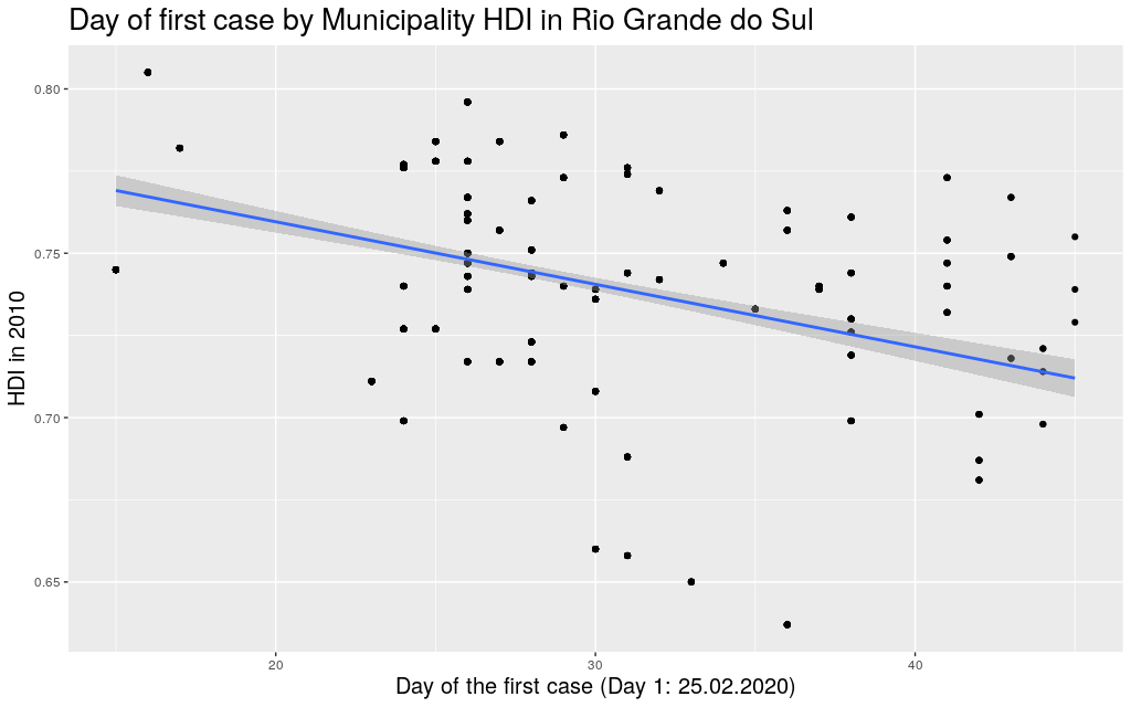
It looks like the trend is also there: the higher the HDI, the earlier the day of arrival of the virus. So I thought I would play around with other states. Since I mentioned São Paulo (SP) and Amazonas (AM), maybe it makes sense to look at them too:
Indeed, this trend is literally in all states of the federation:
Coming back to the question that spawned my interest in these graphs, namely why the Coronavirus took longer to get to Africa, I think I can try to answer this using the information I just gathered. I am of course not saying that this is the only explanation for the delay; I am saying it is likely part of the explanation. To make my explanation explicity: I believe the Coronavirus took longer to get to African countries, among other reasons, because the Coronavirus depends, to be able to travel, on infra-structure, connectivity high enough life-standards to a point where traveling would be a “commodity”. This is not so much the case in less developed countries, many of which happen to be concentrated in that continent. (I mean… I can say for myself: traveling was not really “a thing” for me in Brasil.)
At this point, it is useful to mention: when analysing the data of Brasil, it makes more sense to think of it as a continent, just like Europe, than as a single country. The spread of the virus in São Paulo is parallel to the spread in a region like Italy. (Indeed, as mentioned, the state of São Paulo is more or less the size of the UK, and my state, Rio Grande do Sul, is more or less the size of Italy.) It would be strange to think that one can know much about the developments of the disease in the UK based on information on the number of cases in Italy, and still this is precisely what many are doing when trying to assess the Brasilian situation. When considered these points, it becomes easier to explain why the virus didn’t wait so long to get to Brasil. As we’ve seen, it did get to the most developed areas first.
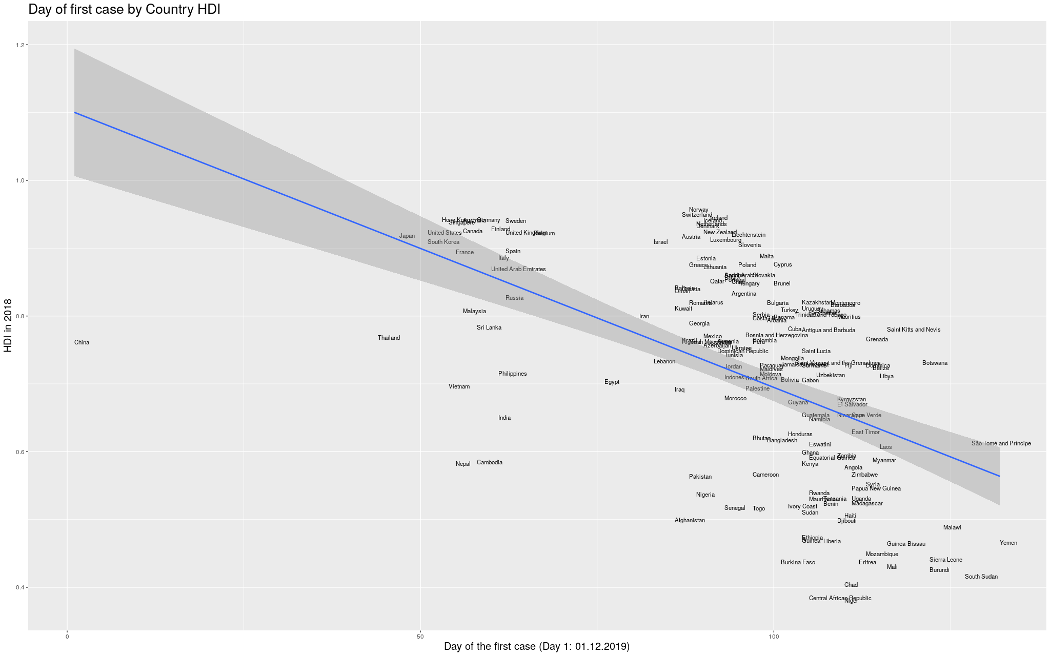
Let’s go back to the Africa argument. I started by taking from Wikipedia the List of countries by Human Development Index. Of course, what counts as a “country” is a little complicated, and depending on how I count I can get slightly different results, but I will assume this wouldn’t change qualitatively my results here.
Then I tried to find the date of arrival of the Coronavirus in each country. This was a little hard to find: the internet is currently flooded with news and websites showing the development of the disease, and the data is super disorganized and spread over so many pages and websites. I eventually, after quite some browsing, found the Wikipedia 2019-20 Coronavirus Pandemic by Country and Territory. I like that they at least say “and territory”, not to be too politically incorrect: the list is flooded with “unrecognized regions”. This was the best I could find, so it will have to do. The table is in a hard-to-process format, but after some fiddling I managed to transform it into a CSV that did the job. The reason why I’m mentioning this here is because I am afraid I might end up missing a few countries, but hopefully this won’t be that bad.
Without further ado… I merged the two datasets, and produced the following graph:
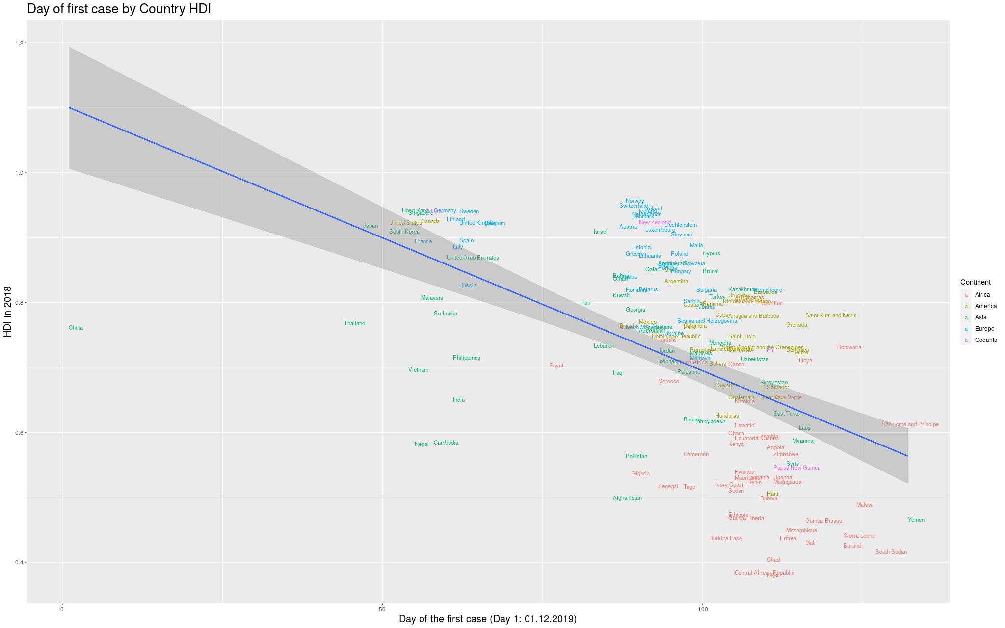
I wanted to make it more explicit which countries are in which continent. I thought some color would help. I got the data for the continents from another Wikipedia article: List of countries by population (United Nations). I still decided to show the previous graph in case I lost data with the merge between the data I had used so far and the data I got for the colors. So, here is the same graph as before, with colors by continent. (Importantly, I refuse to call my continent “Americas”, so I renamed it to its real name, the singular, America.)
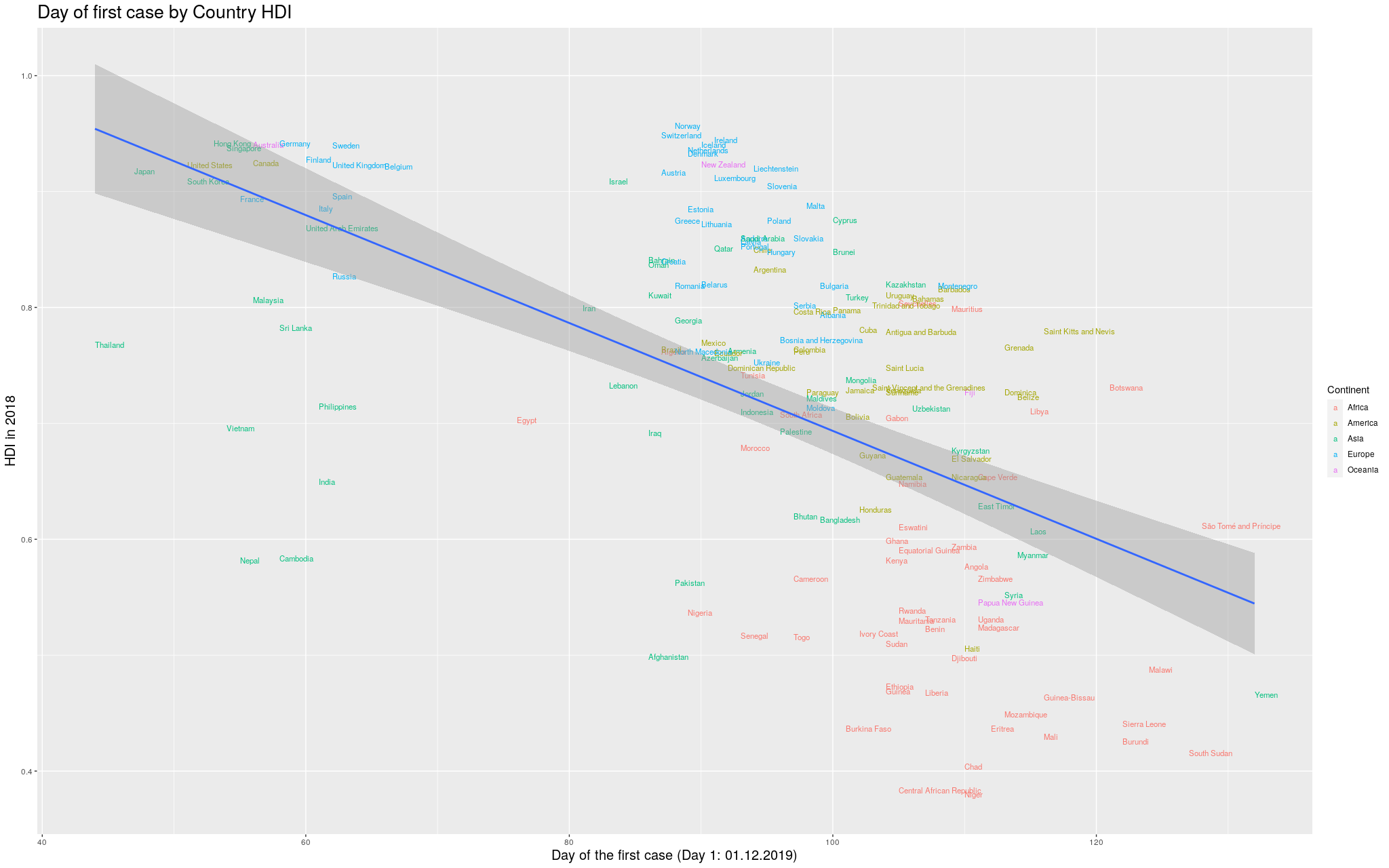
Finally… because the disease took so long to get out of China, you can see that the delay more or less “skews” the trend line. In fancy words, that China point there breaks the assumption of heteroskedasticity of the regression, and I’d like to fix that. In the following graph, I removed China, so that we could see better how the trend line would look like:
I was impressed with how consistent the results were throughout this exploration: in whichever level you look, the more developed a place, the earlier the virus arrived. I am curious if other good predictors like this one will arise in the future. I hope to have convinced the reader that this is a good predictor. Of course it is not the whole story, but I do think my playing with the data brought up some nice insights.
Hopefully, this was an interesting exploration of the data as it is available in the internet. I am positively surprised with how easy it was to manipulate all this data. If you happen to use these graphs, I’d be thankful if you point to my blog =) I’m just a random person on the internet playing with data.
Footnotes
-
The Human Development Index for each state and municipality is accessible here. Notice that the HDI depends on factors like longevity, education, and GDP per capita. More details on how it was calculated can be found here and individual queries can be made here. ↩
-
It may be that I just didn’t look for the correct keywords, or that the papers have some fancy technical terms that I don’t know about. (At the time I was reviewing this text, I actually found this paper, which I still didn’t read, but which might be precisely what I was looking for. ↩